matured to perfection
When at first you do succeed, try and find your deeper mission.
The evolved Red Car Wine story begins with its founding in 2000 by Carroll Kemp, Mark Estrin and and Richard Crowell. Their first 50 cases from a single ton of grapes produced a high scoring Syrah, and later an additional value brand garnered nationwide acclaim — yet the owners realized that their early successes failed to speak to their true calling.
Wanting to invest in the idea of balance and terroir in California — that is, the complete natural environment in which their wine is produced, including factors such as the soil, topography, and climate — Red Car refocused its efforts on producing wines made in small lots using minimalist intervention techniques like native yeast fermentation, gravity flow, and natural acid. Their reinvigorated mission simply put: source great grapes, make great wine and market it in an inventive, original way.
“Everyone loves the new brand expression. Everyone loves the new website. Everyone loves the new labels.”Carroll Kemp, founder & winemaker, Red Car Wine
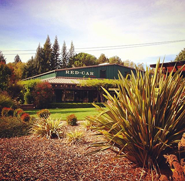
We met with Carroll and his team on a sunny day in sonoma and had a casual discussion about the start of red car and its path to where it is today.
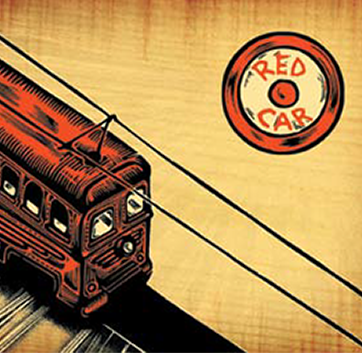
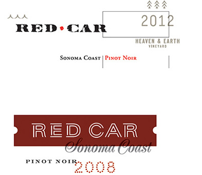
Given the evolution and growth of Red Car Wine, it is no wonder their previous branding had many different and even conflicting looks. Their logo had a resemblance to Target, as well as the circus (neither a suitable connotation). And its whimsy was disharmonious with Red Car’s sophisticated, nuanced taste and award-winning reputation. Their various artwork style labels, although interesting and original, made for a confusing presence in the marketplace that didn’t represent the direction Red Car Wine was heading.
To put it in wine speak, their original approach was fruit forward, new oak, loud presence, high alcohol, crowd pleasing wines and scores. Their recalibrated aim is a more subtle, high acid, broad spectrum, low-alcohol wine that best reflects the West Sonoma Coast and artisan winemaking.
What was their vision of success for the new brand?
The one main idea Red Car wants to communicate is Craftsmanship that is true to the terroir—the particular place in the West Sonoma Coast, its history and roots to the Burgundian heritage. They envisioned a more refined and subtle version of the current brand characteristics, focusing on expressing the Pioneer qualities of a passion for trailblazing and adventurism, combined with the Artist’s creativity, inspiration, and a talent for channeling the fullness of the human experience into tangible forms.
Our Goals for Red Car wine’s Rebrand:
- 01
- Demonstrate clarity, consistency, and value in the marketplace
- 02
- Place Red Car in its historical context while setting a higher standard
- 03
- Respect tradition without feeling stodgy
- 04
- Express an artisan approach that emanates craftsmanship
- 05
- Connect to and explore the importance of “place” — West Sonoma Coast, not Napa
- 06
- Evolve the brand while incorporating a nod to its history
Archetypes
Scope of Work
Our explorations
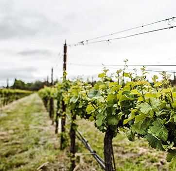
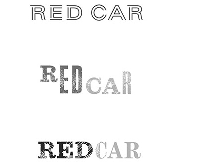
Through a vineyard visit, client conversations, market research and all the understanding we could grasp about Red Car’s unique approach to winemaking and aspirational brand, our creative team examined a visual sense of place through typography, color and imagery. Handcrafted type embodying Red Car’s emphasis on craftsmanship, imperfectly formed lettering… coastal waters meeting up to land, different map concepts, geology, textures, image references in unexpected combinations.
Each of Red Car’s winegrowing decisions comes to fruition in crafting aromatic wines of complexity, finesse and balance. So too, the most detailed decisions of the branding program we developed would become the meaningful story their new branding tells.
“It was a challenge to balance the voices involved in this project. After our initial design presentation we were able to focus in on highlighting the vineyards and their unique surroundings, which became a critical part of the labels themselves. Our partnership with the winemaker, Carroll Kemp, was invaluable through this process and the end result was an extremely successful collaboration.”jon campbell, design director, chen design associates
Our Solution

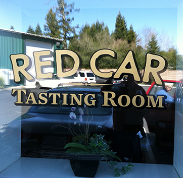
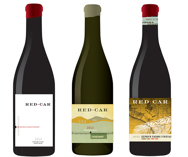
The integrated branding program we developed begins with a foundational logo that appropriately evolves the original and its value. Building upon this, we provided brand assets that encompass a new color palette, cohesive typography choices, rich graphic elements and patterns. These detailed efforts came out of many visits to the vineyards, conversations and coaching stakeholders through our Archetypes in Branding process to explore and solidify its most resonating personality traits along with visual mood boards. We delivered original art for wine bottle front labels (two tiers of wines), a system for the back label, the enclosure (cork , capsule, wax seal), tasting lounge signage with companion printed collateral, and last but not least Red Car’s new website.
The selected identity is definitively grown up while still projecting personality, depth of character and nuance. Focusing Red Car’s original red circles into a minimal but central dot between carefully created letterforms incorporates their history while elevating the brand. The identity can stand out alone, while having the flexibility to add layers of complexity, expressing in the marketplace artisanal sensibilities, high quality and brand clarity.
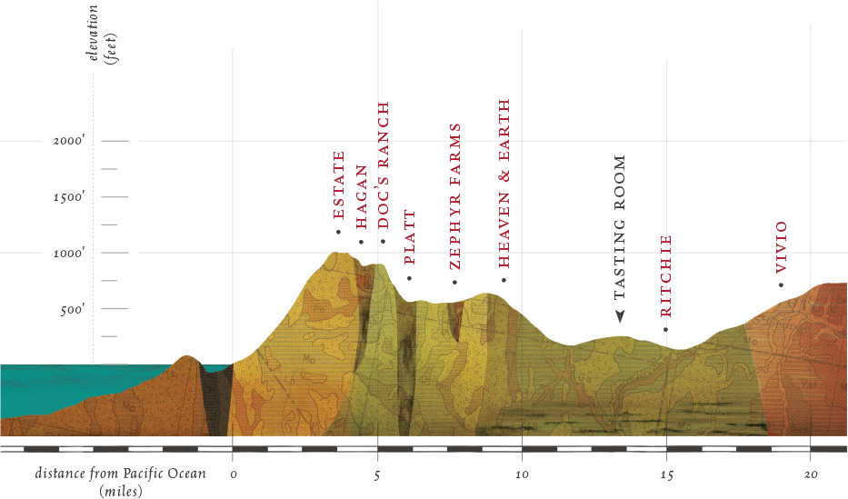
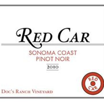
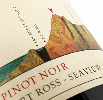
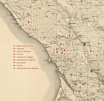
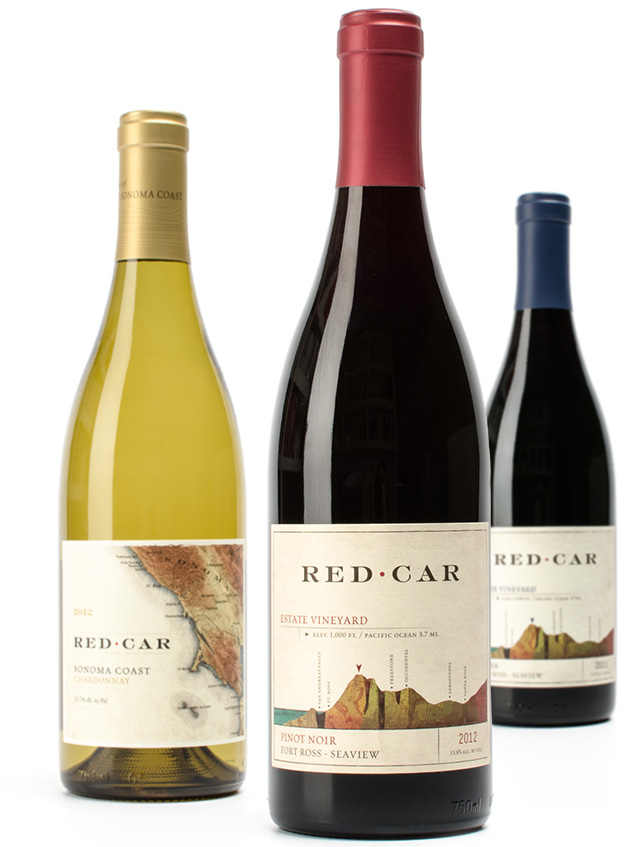
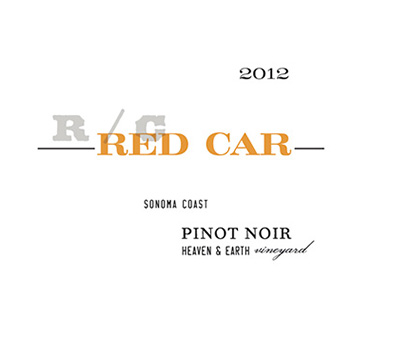
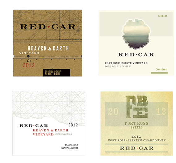
Expanding the brand identity, our label artwork speaks to the most important quality of Red Car’s renewed mission — the location of its vineyards. It was extremely important to our client that the labels give a sense of this special place and all of the subtle effects it produces in their wines. We incorporated elements such as elevation, soil type, distance from the ocean, fog and weather patterns, all of which speak volumes about the characteristics of a wine and how it’s made to the perceptive wine connoisseur.
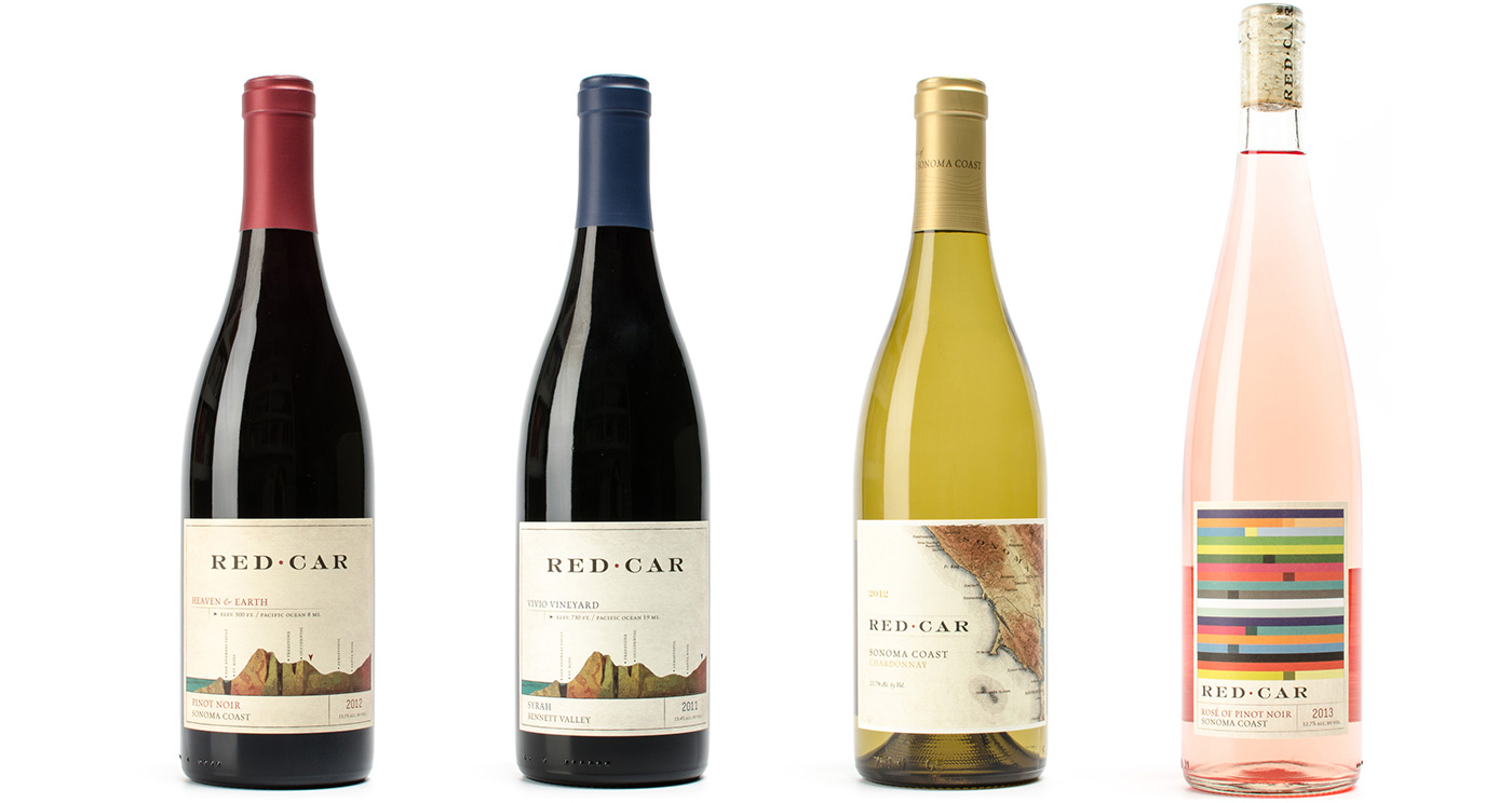
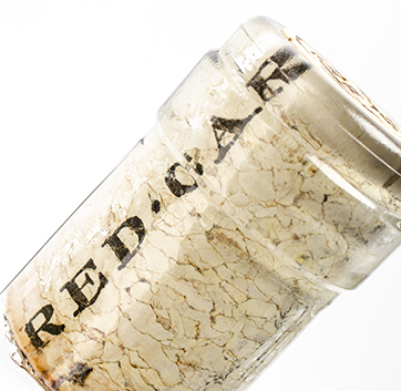
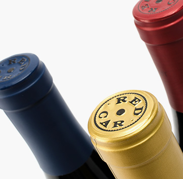
A cohesive but distinguishing look for various wines, expresses craftsmanship and a fresh take on tradition, identifying as its source the West Sonoma Coast and certainly not the Napa Valley. All of the data that Red Car needed to include is organized and tastefully integrated into the overall family look of the brand on each rear label. And artful attention to detail was further given to how the cork and capsule touch points carry the Red Car brand traits.
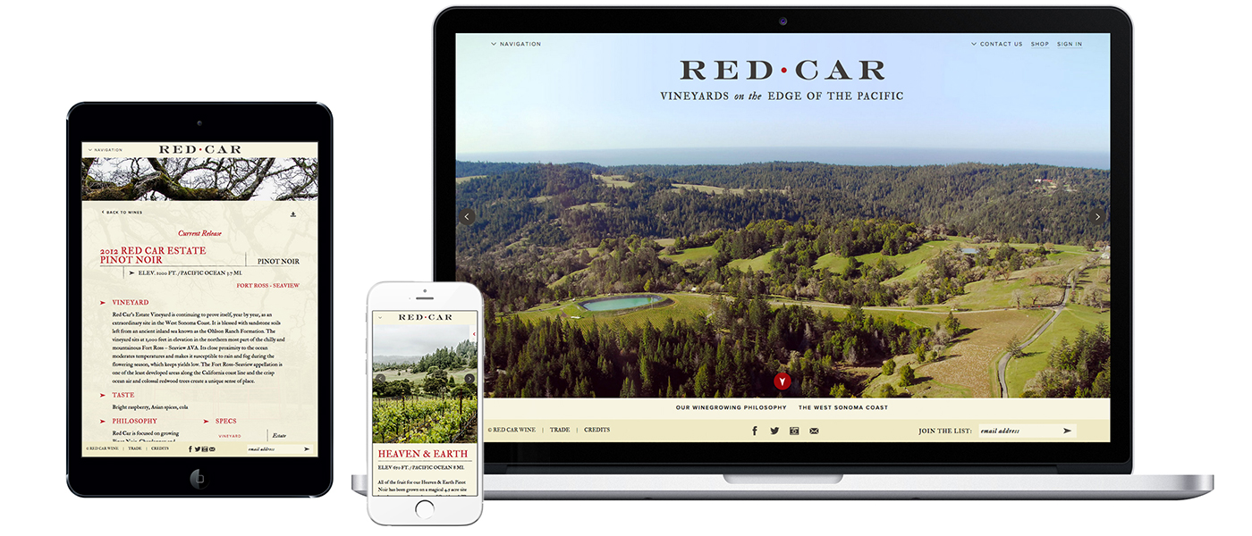
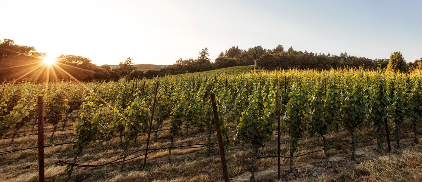
Sweeping, film-quality images transport you through the season to dynamic views of remote vineyards overlooking the ocean. This immersive site adapts to any device’s screen size and transports viewers to explore Red Car’s wine from grape to glass.
view the full site at redcarwine.com
“Winemaking is storytelling. The weather, soil and vine are woven together to tell the story of a particular vintage and a particular place. We relate that story…when [and in every way] we communicate… finally, when you drink one of our wines, you are actually participating in that story.”Carroll Kemp, founder & winemaker, red car wine
“The [Red Car Wine] website is very impressive and the newsletter as well as the labels are the best in the business.”Rusty Gaffney, PinotFile
“…each design detail marrying well with the sophistication and subtlety that Red Car Wine pours into their refined craft — and making all the difference.”Oenographic, July 2015


