A cookie stuffed with PB&J. French toast made with chocolate babka. Flour & Branch is the mouthwatering brainchild from Lauren Arnsdorff, and we had the privilege of creating this brand from scratch—from visual identity systems to illustrations to website design.
Scope of Work
Visual Identity System
Art Direction
Logos
Illustration
Photography
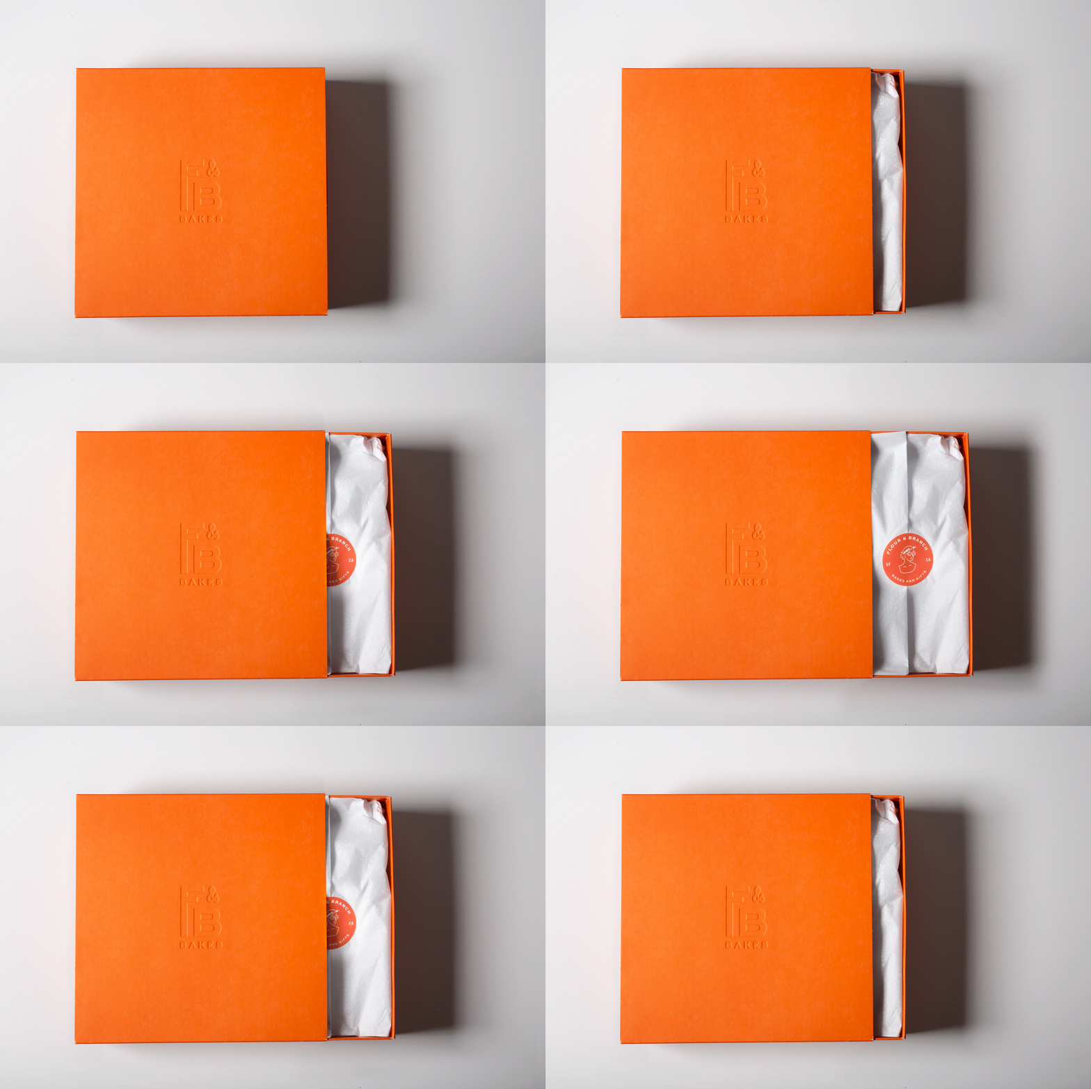
Packaging Design
Packaging Production
Website Design
Website Development
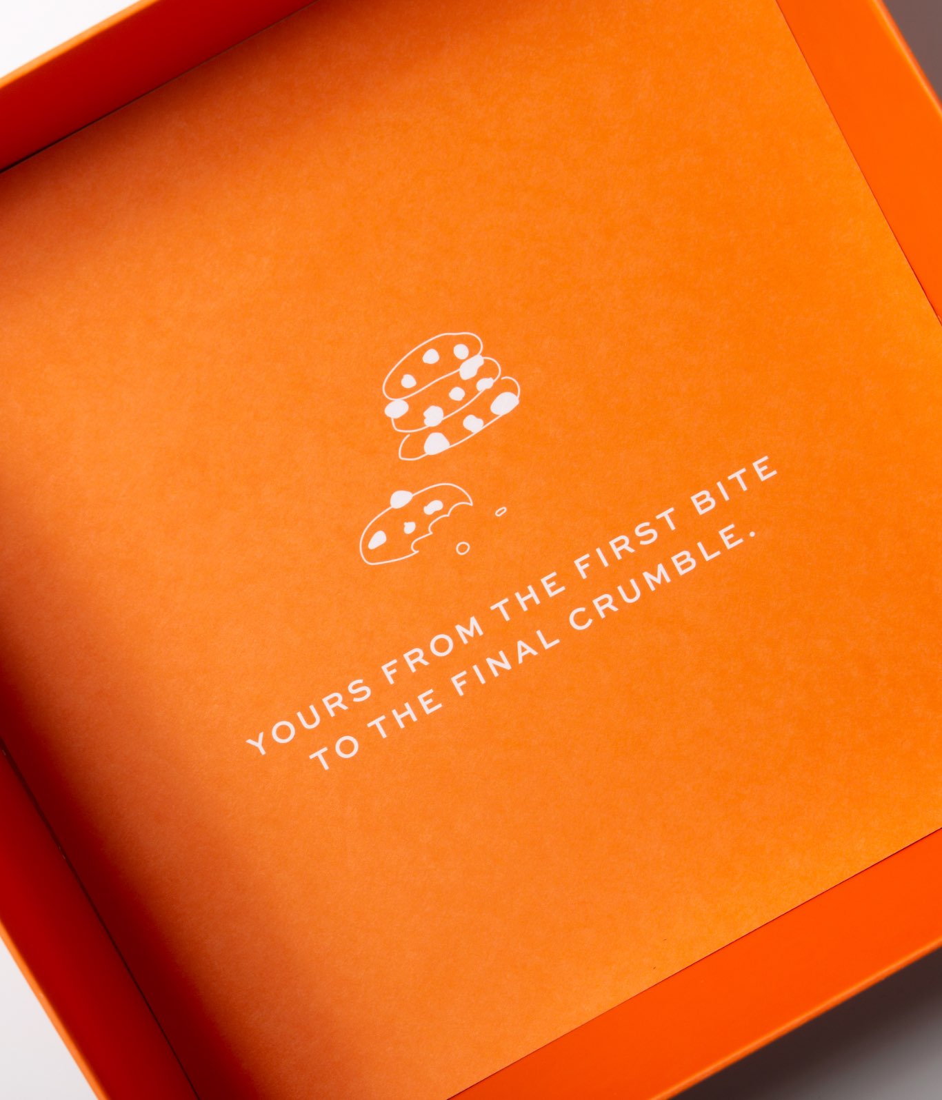
Yours from the first bite to the final crumble.
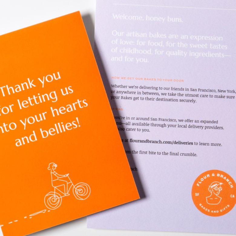
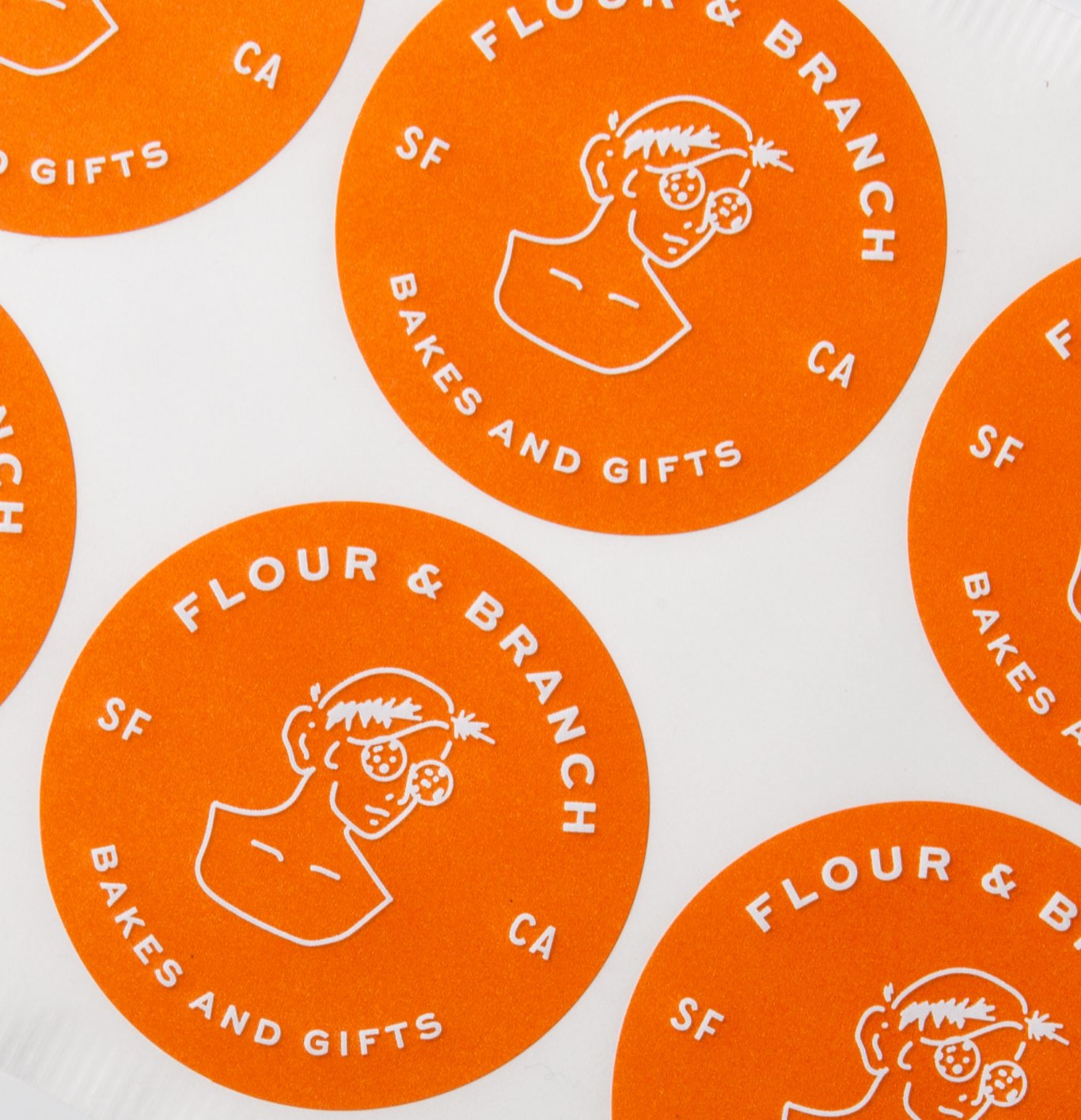
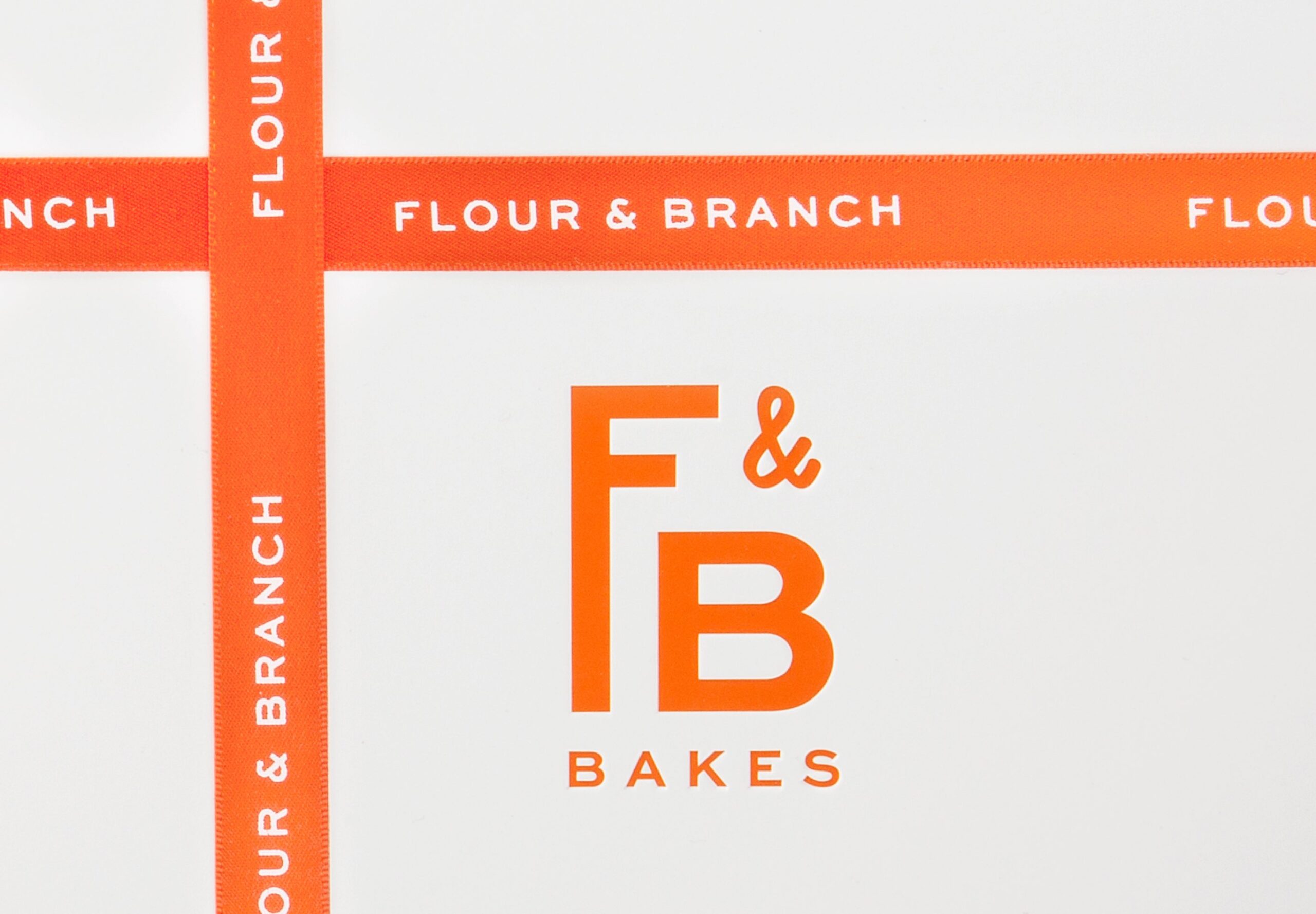
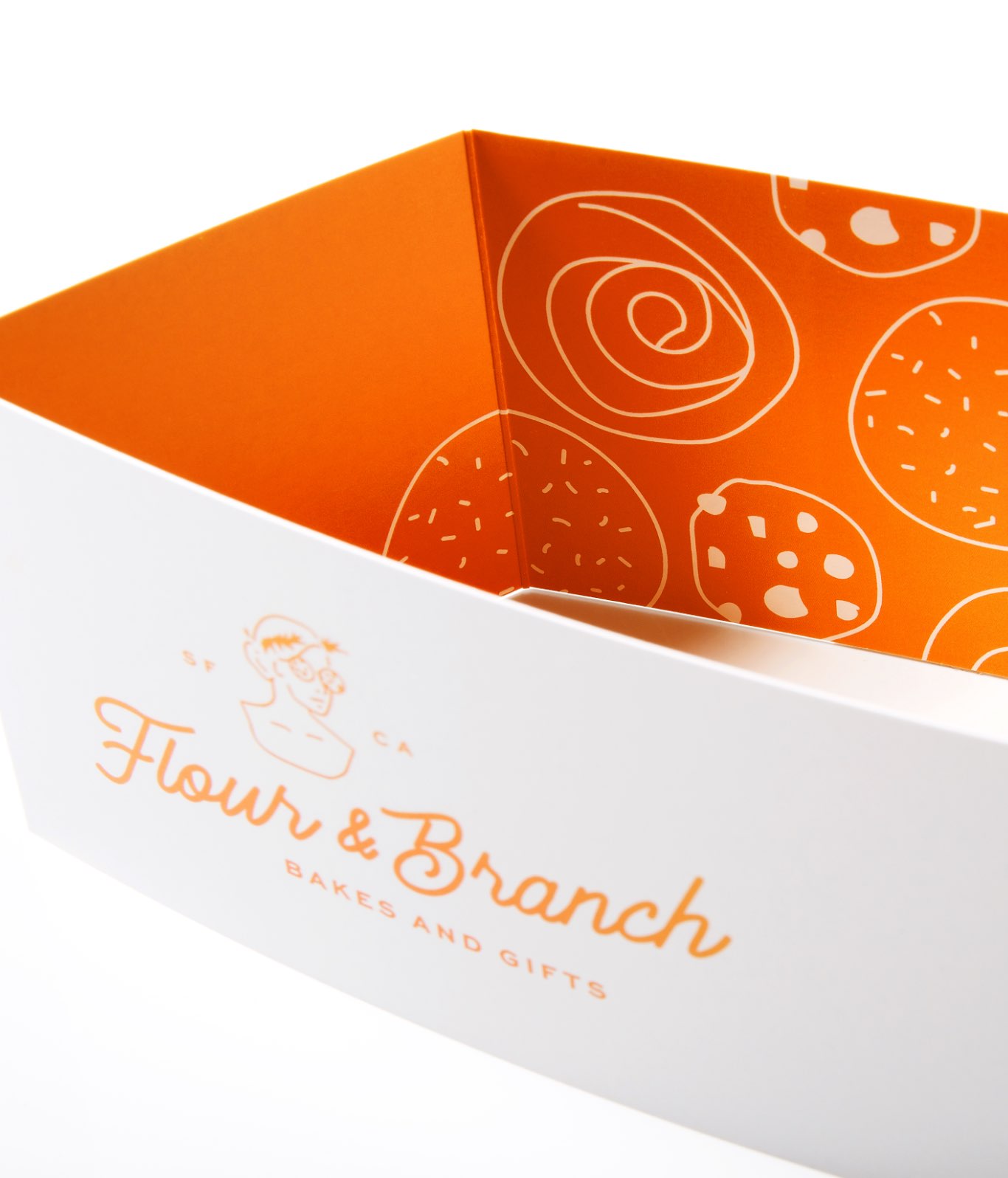
Flour & Branch strives to evoke those perfect childhood memories and combine them with grown-up sensibilities. With that in mind, we created a visual identity that balanced whimsy and nostalgia with modern relevance. The logo represents a woman-owned business with the mission of bringing joy to everyone through delicious baked goods, and the optimistic poppy red captures the brand’s approachability and chummy nature.
Looks as Good as It Tastes
From art directing, prop sourcing, food styling, to photography—we produced a comprehensive shoot to capture exactly what makes Flour & Branch goodies so special.
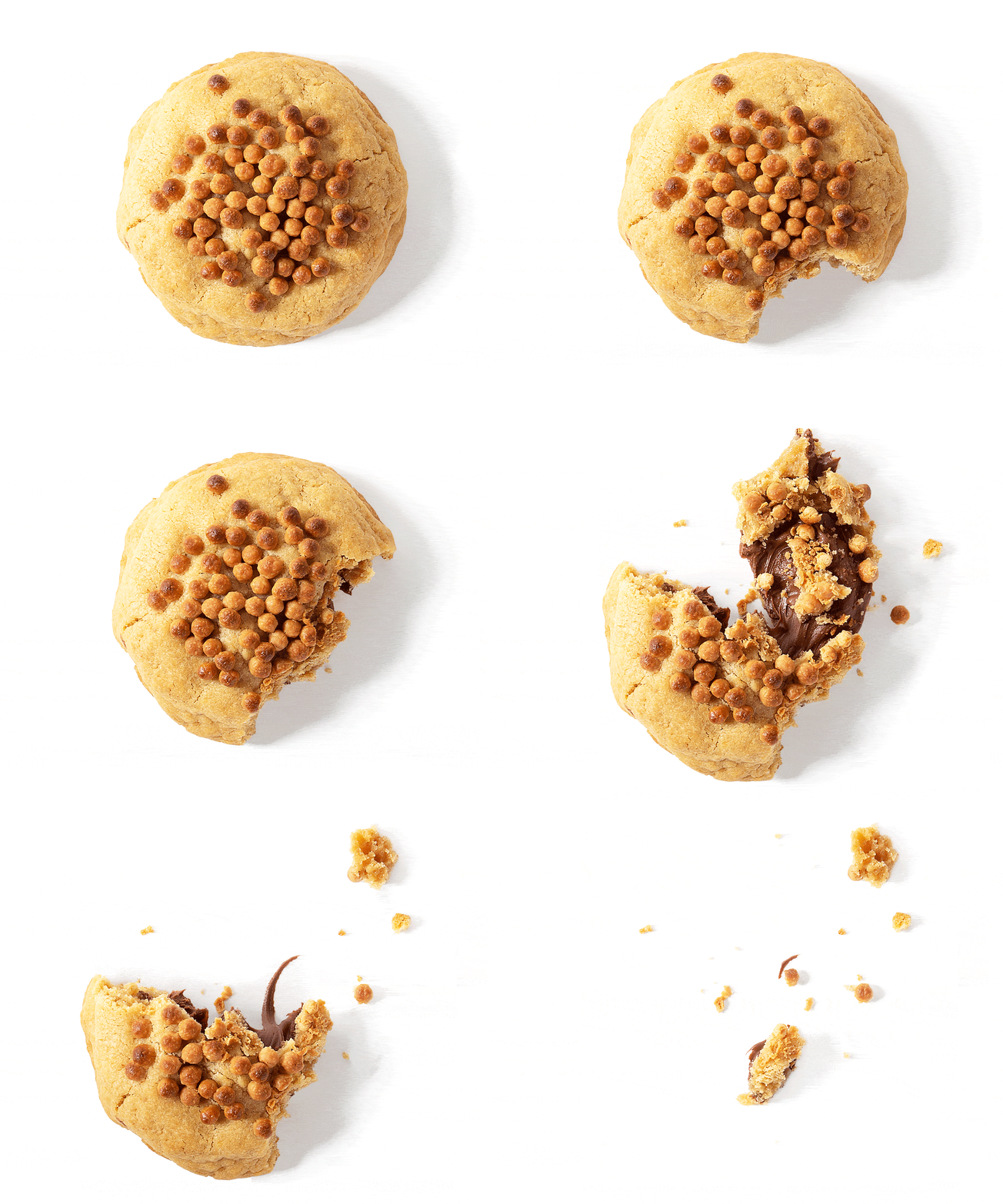
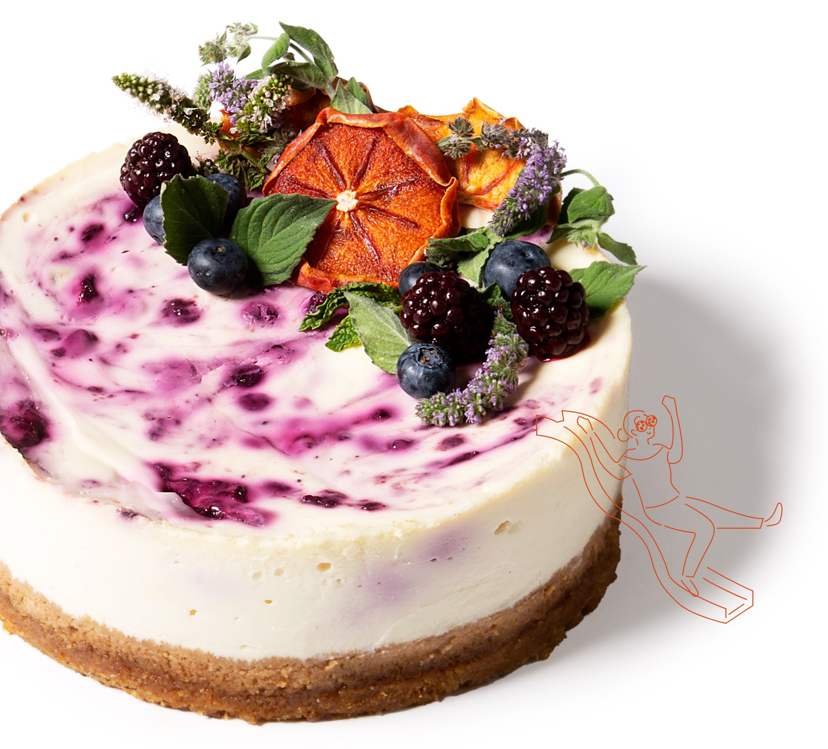
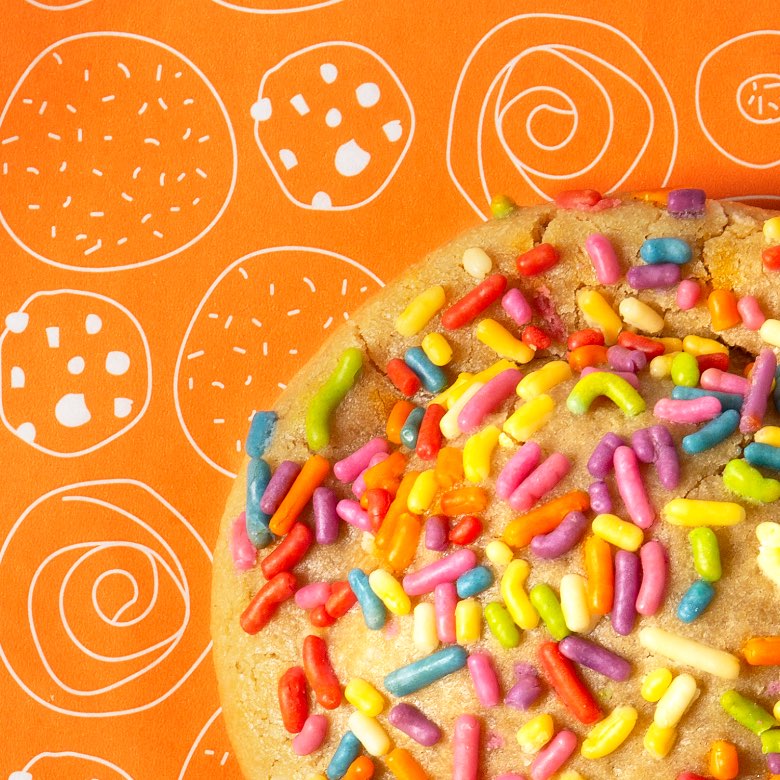
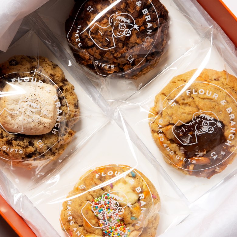
We know you eat with your eyes first, so our goal was to make the cookies, cheesecakes, and french toast look as tantalizing as possible.

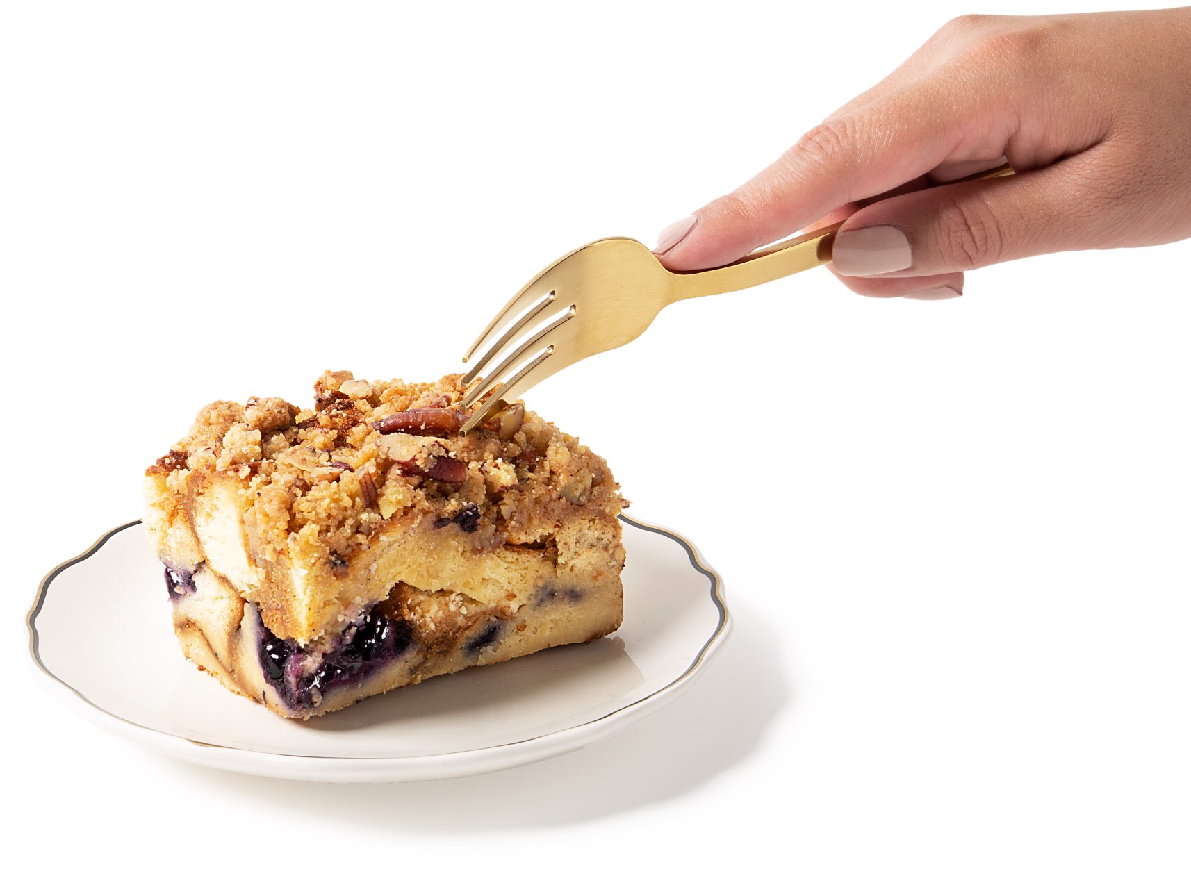

A mouthwatering e-commerce experience
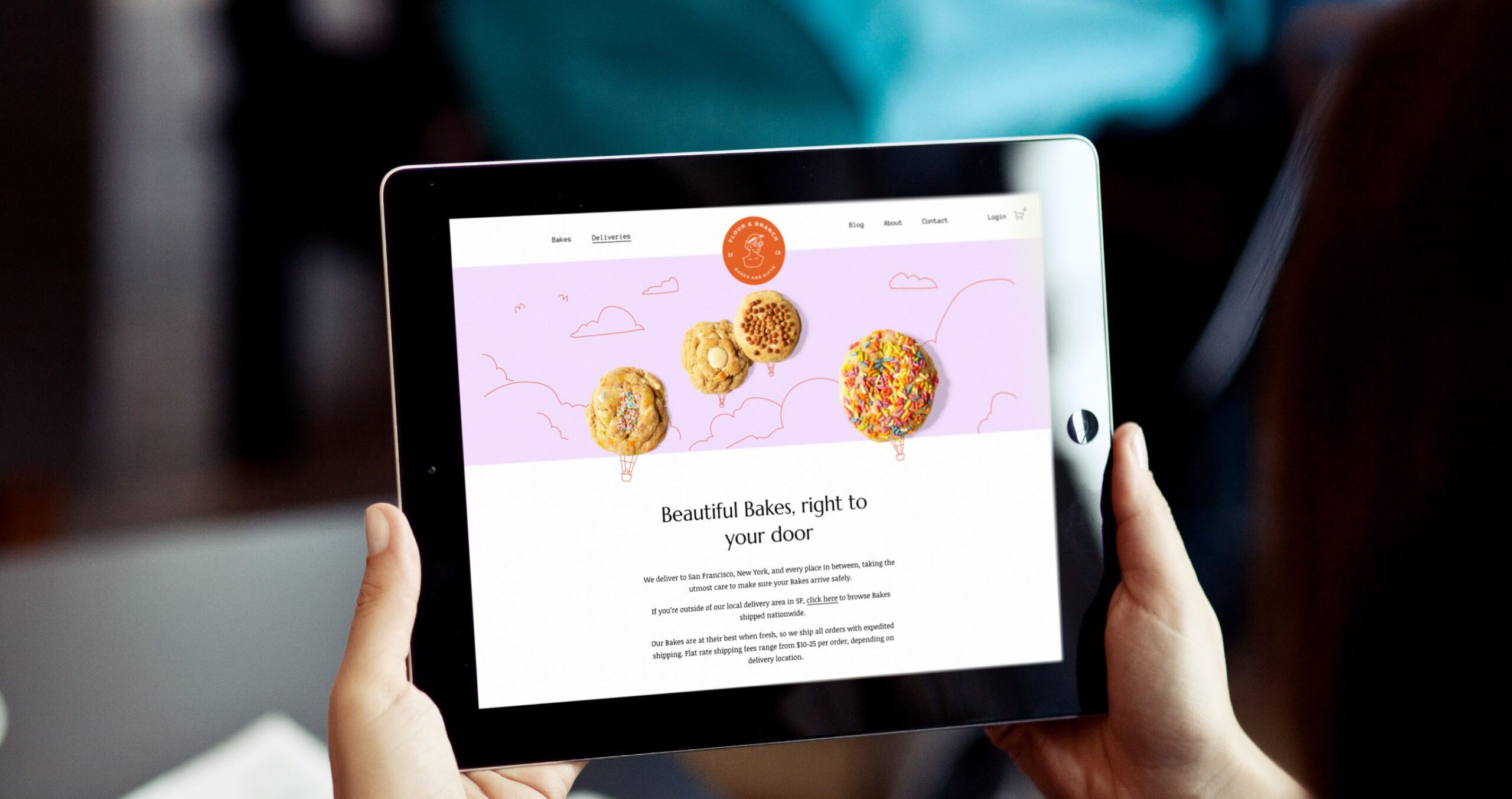
We carried the brand’s whimsy and nostalgia into a responsive Squarespace website, recreating an in-store shopping experience through layered details, rich product photography, intentional use of brand visuals, and a tease of discovery behind each click. The hero images further invite customers into the delightful world of Flour & Branch, while the animations bring the products to life.
![]()
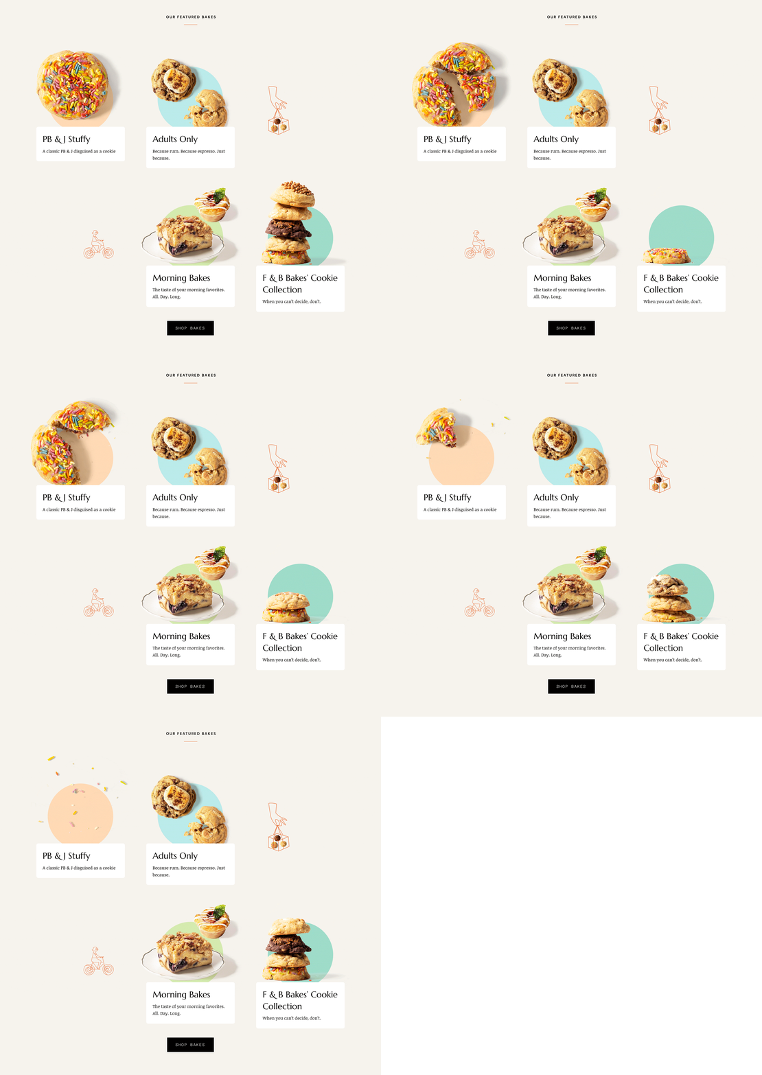
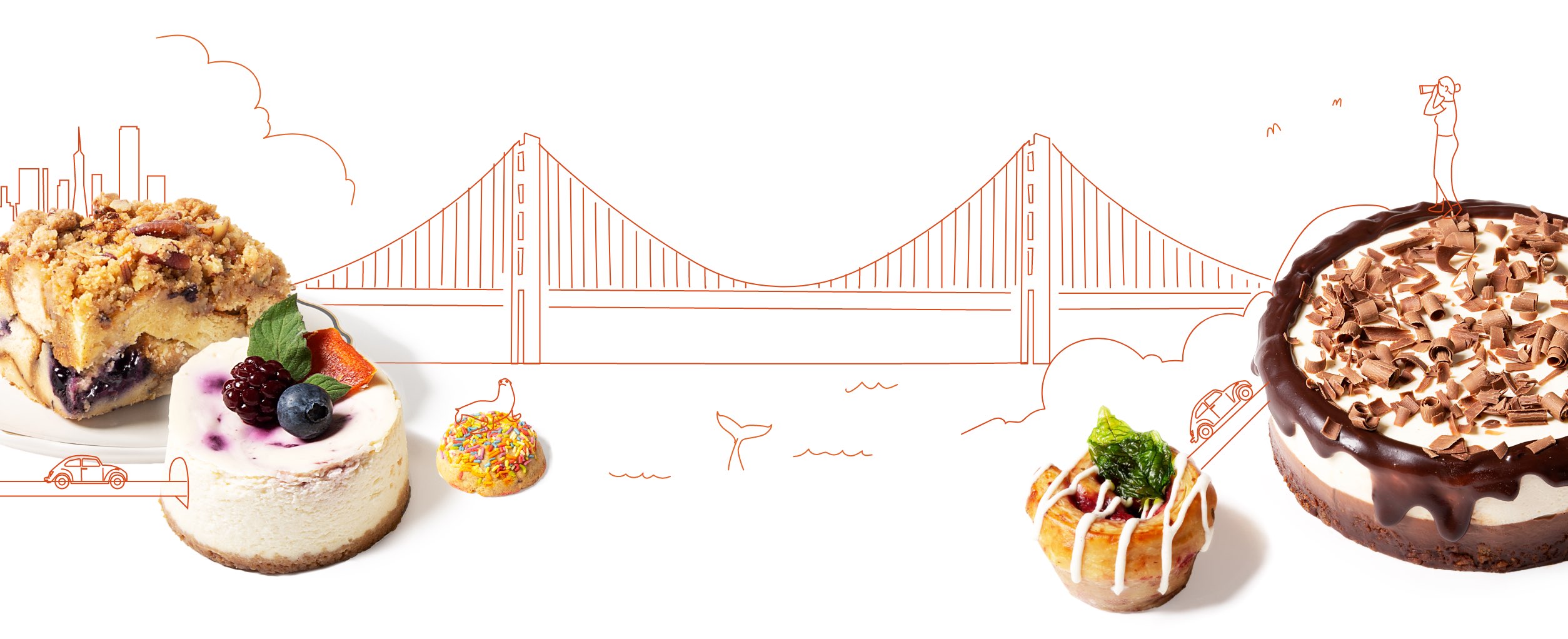
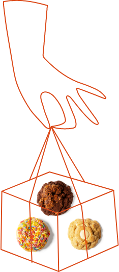
Using the same sketch-style featured in the logo, we incorporated illustrations into the website to playfully interact with the product photography.
“The CDA team made my dream and vision for my brand come alive and treated this concept like it was their own, and I couldn’t be more appreciative of them and the final outcome. The packaging, website, and branding are truly superb and unique, and each customer I’ve received feedback from has commented on how cute and beautiful the entire package looks.”


