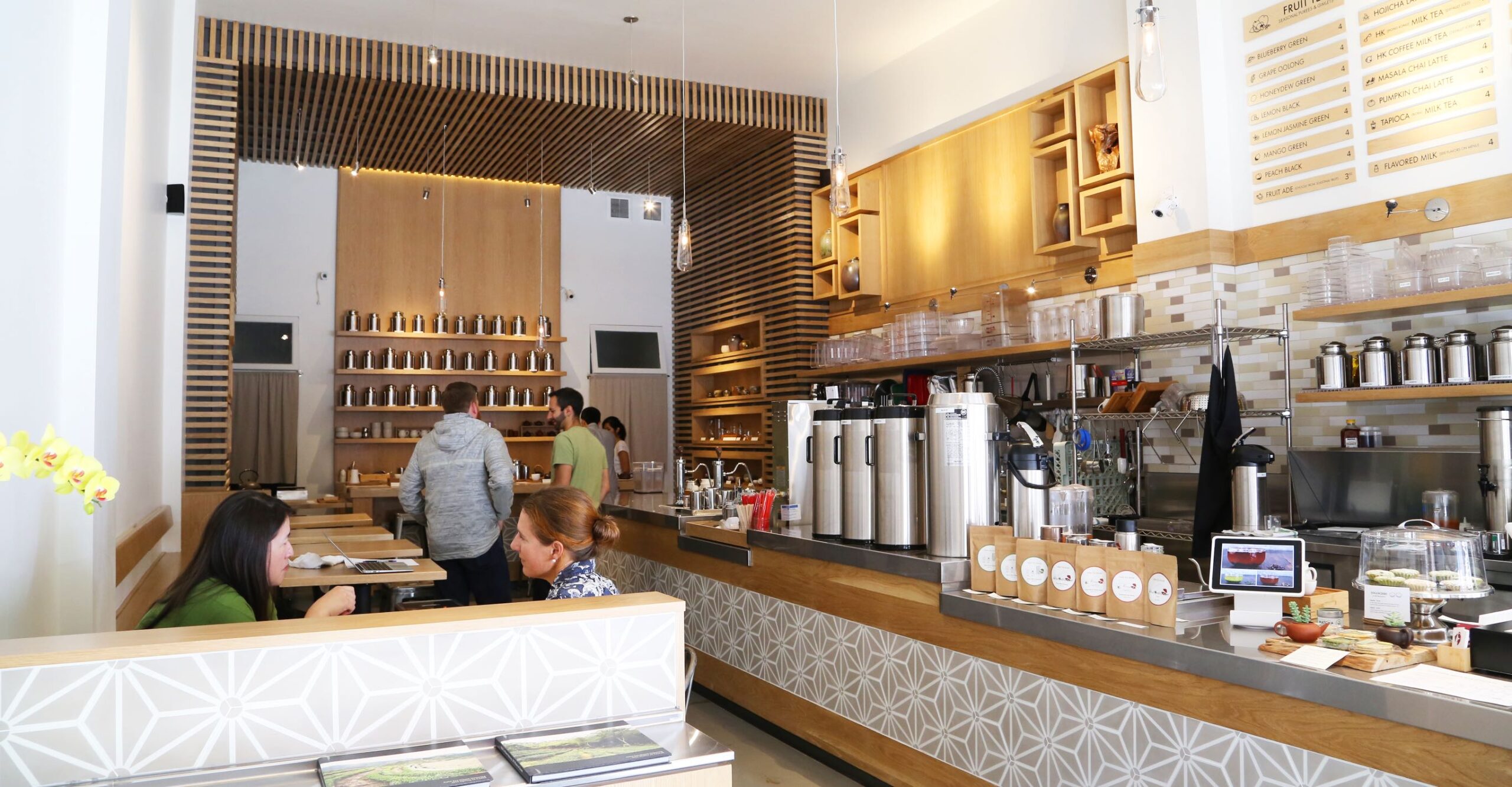
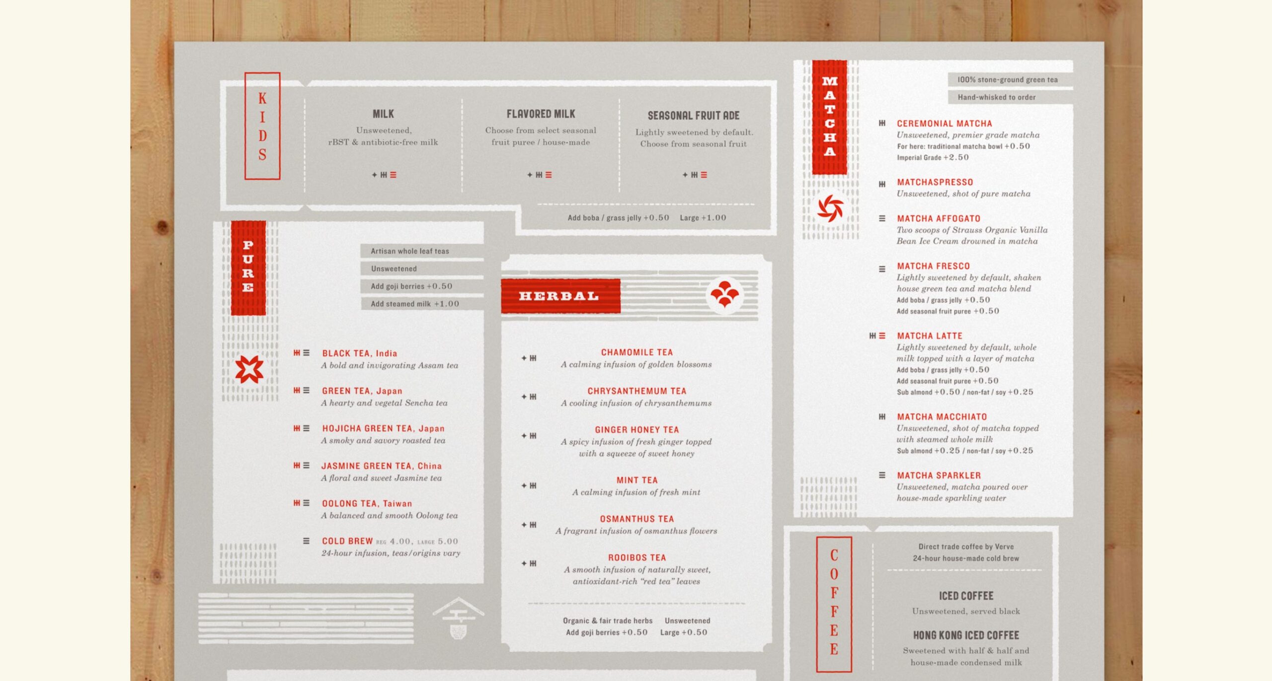
To help customers navigate Asha Tea House’s extensive offering of special teas, we developed a system of icons, colors, and packaging that not only informs but adds beauty.

Asha is Taiwanese for “someone who enjoys life” and this describes the experience of tea culture that Asha Tea House wants to cultivate. Offering artisan whole leaf teas that are directly sourced, with freshly made boba and curated tea ware, this small business is expanding. The owners engaged Chen Design to advance their homegrown visual identity and develop the foundation for a comprehensive brand that thoughtfully included all touch points.
Scope of Work
Art Direction
Identity
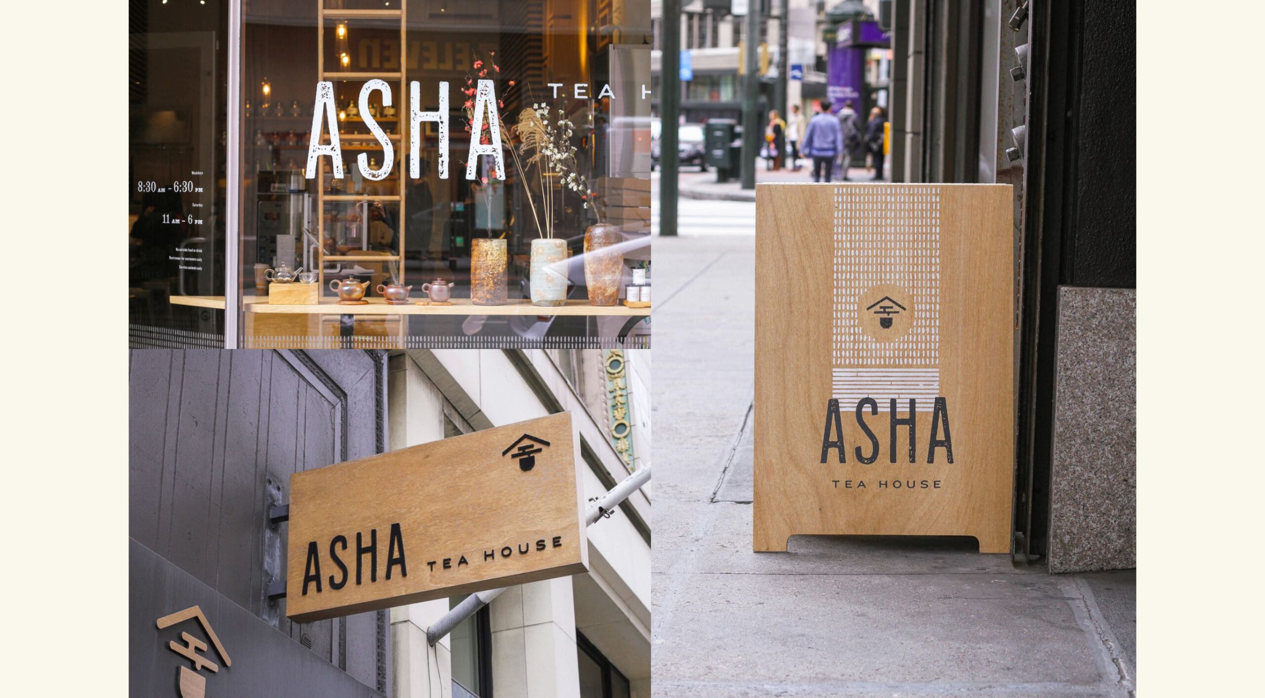
Signage
Exteriors
Packaging
Typography
Illustration
Collateral
Brand Guide
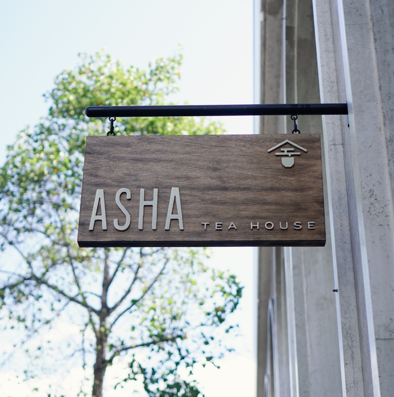

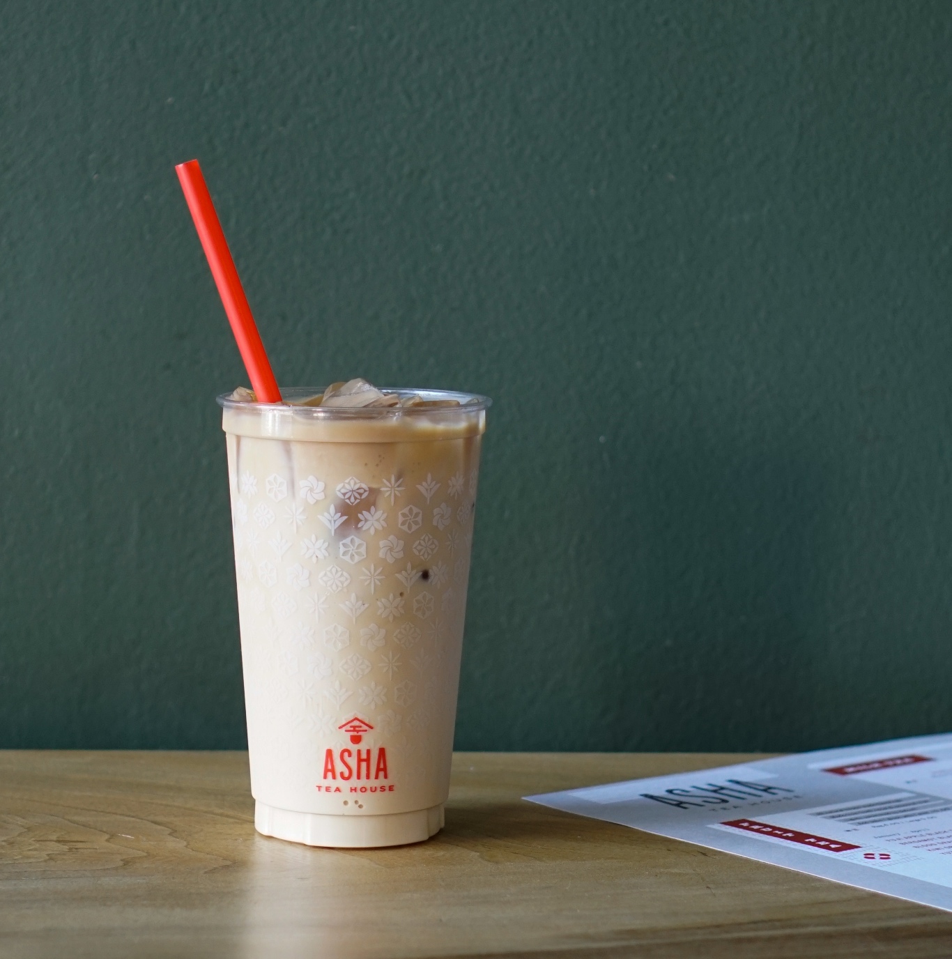
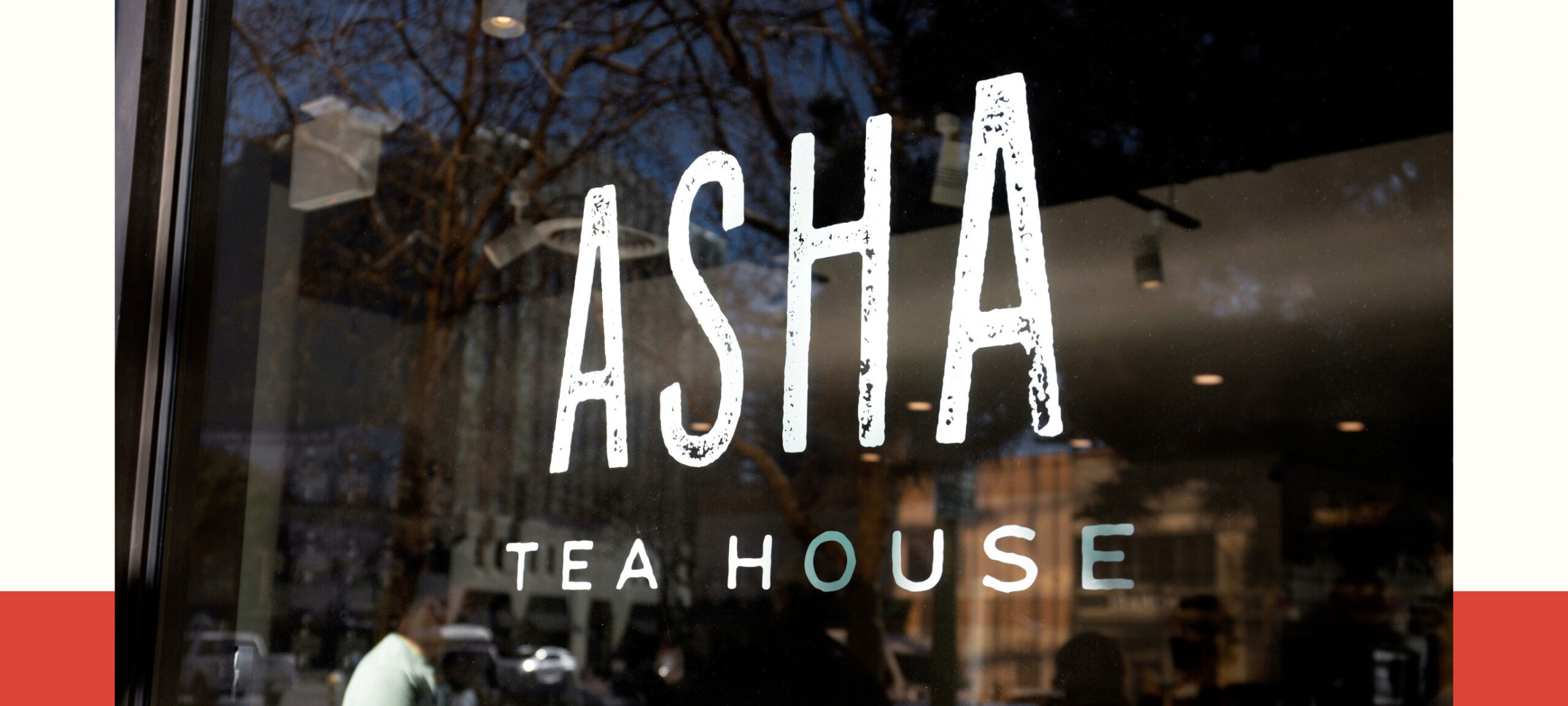
Our re-envisioned brand identity plays on Chinese iconography to present a sophisticated, globally aware, yet happy-hearted tea experience. We infused meaning into symbols, carefully considering details of typography, pattern, material, and balance, employing a wabi sabi aesthetic that humanizes and softens.

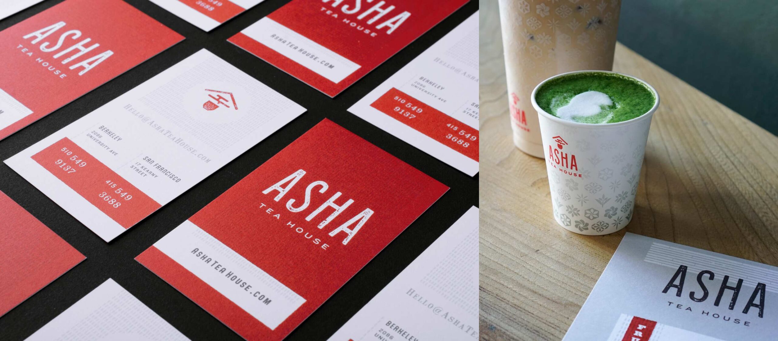
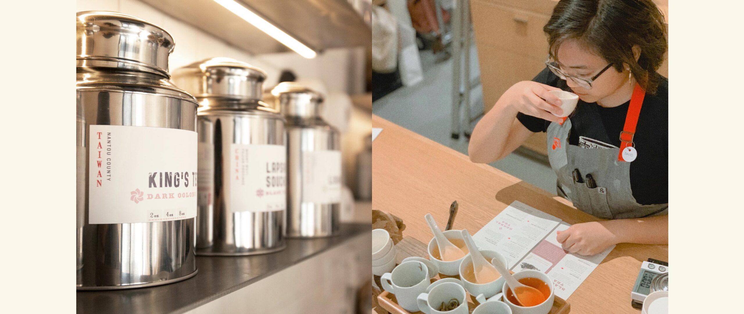
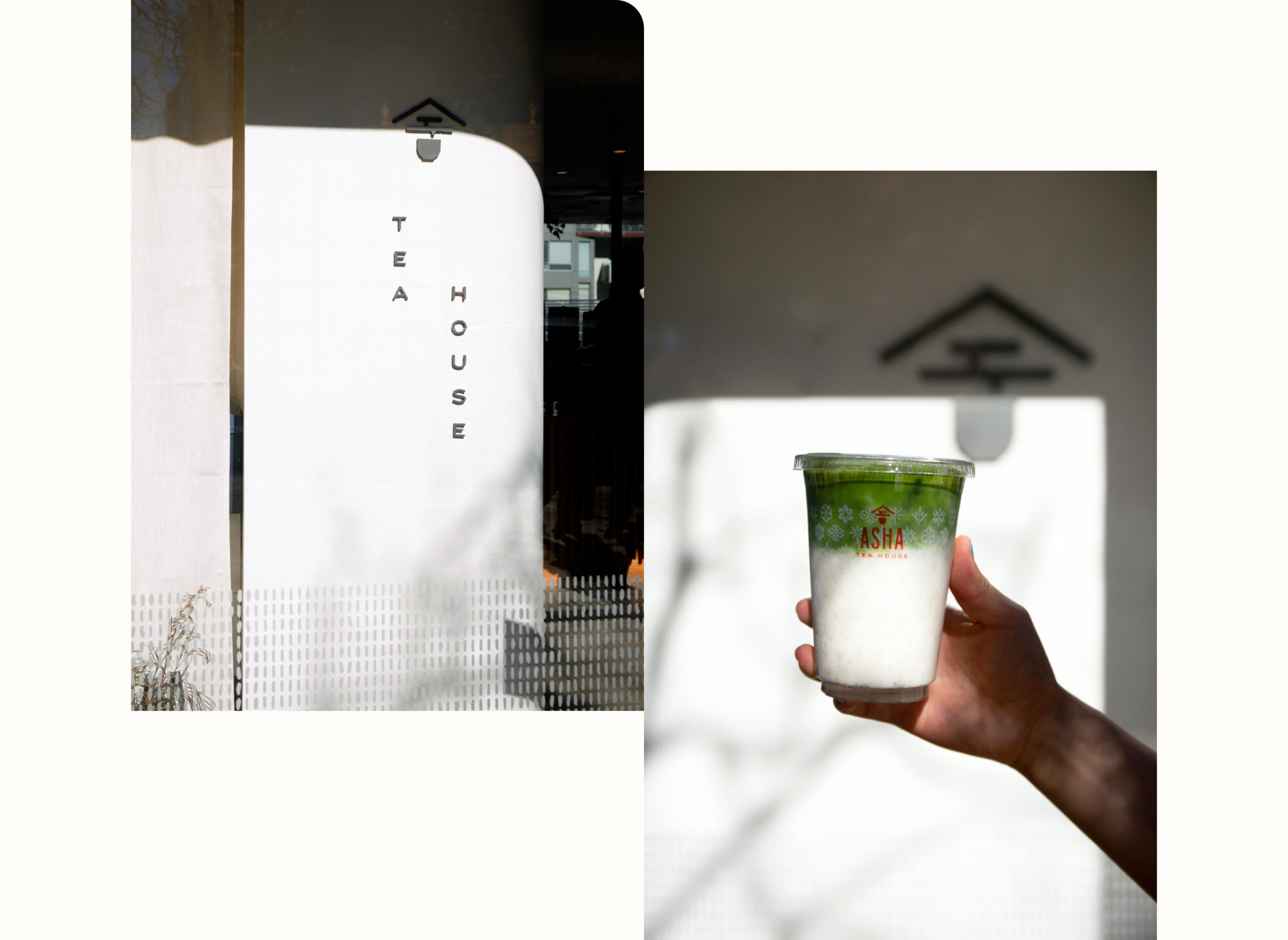
Viewed from the street, online, in hand or on tea house shelving and walls — each element works together as an integrated system that unifies the Asha Tea House brand, yet allows for the personality of its distinct locations and communities. Our design expertise strengthened their position for growth, increasing their authentic brand representation and following.
“Every time I come here, the branding and menu board seem to look more and more beautiful. I just appreciate how this brand is nicely designed—the tea packaging, the menu, and the cups. But [what] I enjoy more are the drinks.”Yelp reviewer
winner
2017 American Graphic Design Award
