


Saving what matters in these times has taken on new meaning, beyond the original intent of @stasherbag #SaveWhatMatters campaign, and we're inspired to see Stasher continue making moves for healthy people, along with a healthy planet. Our work in crafting handwritten logos, illustrations, and infographics was done with those same values of generosity, community, and interconnectedness in mind. Let’s take care of each other. View more from the project through link in bio. #chendesign
Thanks @GDUSAmagazine for the feature of our @AlaffiaSkinCare work 🙏🏽. https://t.co/jRXtL3n4JE
Super helpful article and visuals on why social distancing is critics at this time. Stay healthy all! https://t.co/rgW29a5dZQ
Stasher is on a mission to reduce the use of single-use plastics, and Save What Matters is their campaign to empowe… https://t.co/cUN202ZXUm

Stasher is on a mission to reduce the use of single-use plastics and their harmful effects on the earth, and Save What Matters is their campaign to empower people to join them in their efforts. We partnered with @stasherbag to bring the look and feel of #SaveWhatMatters to life, and are excited to share more soon. #chendesign

Alice House is an art deco-inspired residential building in the heart of Downtown Oakland and our team was tasked w… https://t.co/kRTD12oZZC
Our work for @AlaffiaSkinCare reviewed on @ucllc #BrandNew today! How did we do? Vote your opinion ✅… https://t.co/4PW6yPHc2r

We provided custom illustrations featuring adorable animals in their natural habitats for @alaffia’s Baobab Baby and Kids line in order to better emotionally connect with customers. Throughout this whole process, we immersed ourselves in the roots and essence of the brand, and our team is proud to be creative partner to Alaffia and support its mission of advancing education, sustainable living, and gender equality to African communities. To see the full case study, click through to the link in our profile! #alaffia #chendesign
For @AlaffiaSkinCare's Authentic African Black Soap collection, we customized letterforms that meld a love for hand… https://t.co/7jlne615ZP

Our task was to solve the challenge of the complexity and scale of our client’s extensive offerings, and we united six different collections—each with their distinct audiences, multiple lines and scents—cohesively under one parent brand. For @alaffia’s Authentic African Black Soap collection, we customized letterforms that meld a love for handcrafted tradition with a modern African-tastemaker ethos. Read more about our process through the link in our profile.
We were charged to “bring back the soul” of the @AlaffiaSkinCare brand through reimagining its identity and packagi… https://t.co/RMATf6eodY

We were charged to “bring back the soul” of the @Alaffia brand through reimagining its identity and packaging, and are excited to share the outcome of our partnership! Alaffia empowers women’s futures and entire communities in Togo, West Africa through their social enterprise model and we wanted to provide unmistakable brand recognition through a contemporary and bold, yet refined and joyful look. Check out the full case study through the link in our profile.
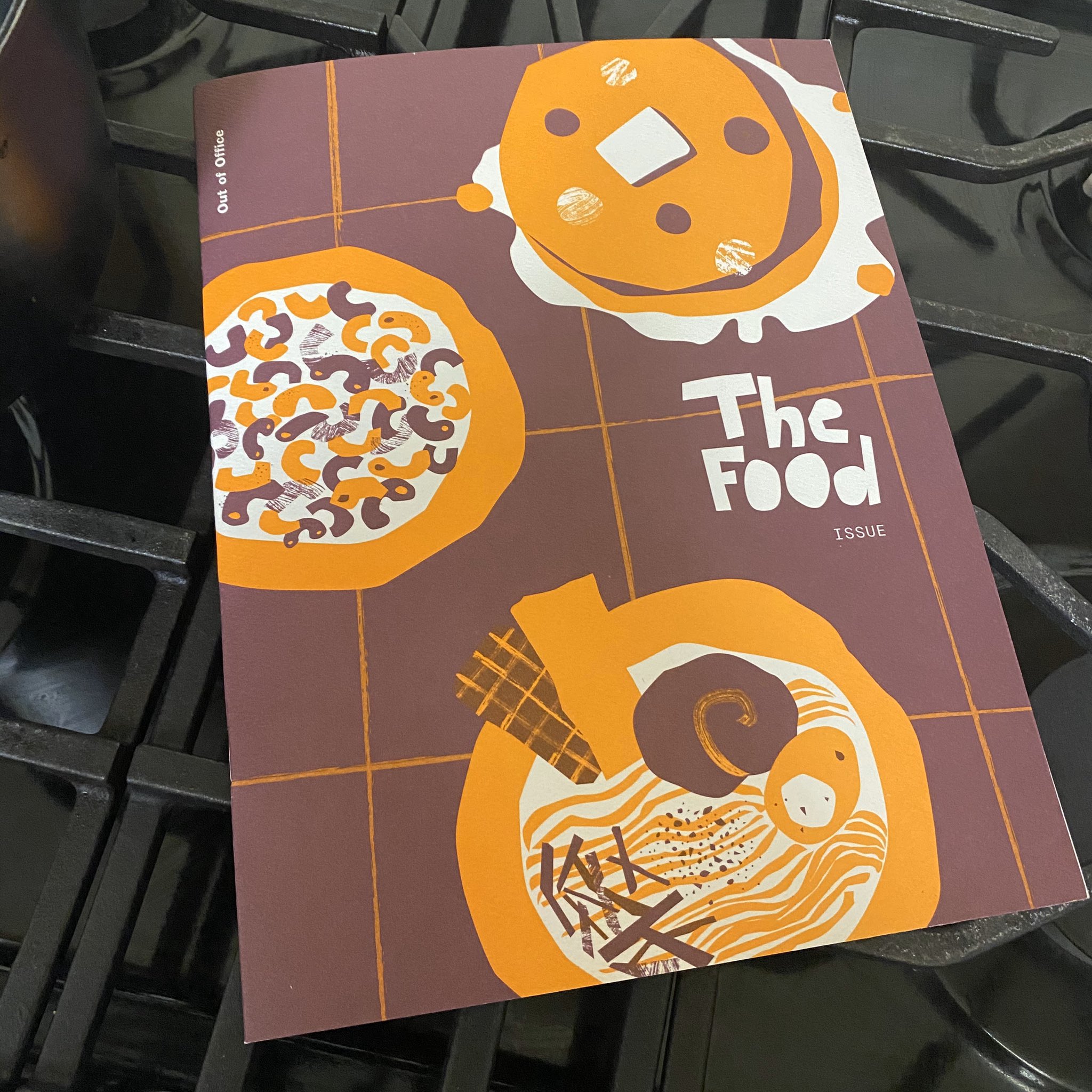
More copies of our OOO zine to giveaway! Reply with your guilty pleasure food and retweet for a chance to win a cop… https://t.co/nQAuixon3D

One of OOO’s articles reveals the surprisingly plentiful connections @josh.chendesign has with the culinary world. We asked some lighthearted questions to some celebrated chefs and so we’ll ask you too. What’s your guilty pleasure food? Let us know in the comments below for a chance to win one of five copies of our zine! Ends 2/12.
I got my hands on @chen_design’s new zine. I can’t wait to dig in. https://t.co/loDeotLWBZ
We’ve got more zines to giveaway over on our #instagram account! https://t.co/TJfAxAP7Ae

Support your local lunch spot! We scouted out 10 eateries for a tasty $10 lunch within 10 minutes of our Uptown Oakland studio. Basil Pizzeria for legit NY style slices is one. Discover 9 more on page 9 of our zine. Tag your favorite go-to lunch place and enter to win a copy of our limited edition OOO zine! Lucky winners drawn at random on 1/28.
We’re giving away five copies of our inaugural OOO zine! Retweet or like and make sure to follow us for a chance to… https://t.co/1C16mLtFm6

Why food? Our team has bonded over making and consuming food together. A cozy reason to connect and collaborate whether we’re out for dim sum or in for potlucks, or simply sharing goodies at our desks, food gathers and nourishes souls… and our creativity. To celebrate, we’re giving away five copies of our inaugural zine! Tag a fellow food-loving friend and follow us to enter for a chance to win. Winners randomly picked by 1/20/20.

“Constraints actually help the creative process,” says our principal @josh.chendesign on the blending of science, art and design, “because without constraints, you don’t force yourself to think about how you can create something outside the box or differently.”⠀ ⠀ The team had fun stretching beyond the familiar full-color comfort zone by selecting and restricting our design to two striking solid inks that would blend into rich duotones and subtle overprinting possibilities for our first OOO zine.⠀ ⠀ Copies hit the streets and a mailbox near you any day. Look for yours!

Introducing Out of Office, a #chendesign team-wide collaboration in the form of a zine. Our first issue celebrates… https://t.co/SAixSSG2Sm

Introducing Out of Office, a Chen Design team-wide collaboration in the form of a zine. Our first issue celebrates food—our favorite, not-just-fancy fare that warms our bellies and fills our hearts (or is it the other way around?). We’ll be sharing a more in-depth look inside the zine’s pages, but for now, just a tantalizing peek. #chendesign


We are terribly saddened by this news. @mwstinson was a brilliant inspiration to so many of us who have a love affa… https://t.co/kMkvjBzZiw

Where the economy, the environment, and quality of life issues intersect, Next 10 provides tools and data that empower Californians to solve the most pressing issues of our day. We've been partnering with the nonpartisan nonprofit, designing their annual California Green Innovation Index, for 8 years running. Communicating dense, critical information in well-organized, visually compelling ways help hone substantial content to focus their important message. ⠀


How is this #BARTetiquette 😑 @SFBART https://t.co/dgiJjVzOvj
With over 100K signatures and counting, #TrumpTower in Manhattan could have a fancy new address.… https://t.co/IxRsLz9G31
EXHIBIT: Timeless iconography and clean typography come together in @chen_design’s new identity for @CauldronCM Ice… https://t.co/pH4pCnWr2W
EXHIBIT: Timeless iconography and clean typography come together in @chen_design’s new identity for @CauldronCM Ice… https://t.co/6AOqi7mFxc

See how CDA created a buzz for @JohnMastersOrganics and the new Honey & Hibiscus advanced hair care collection. We directed all photography and created a sensory in-store experience that showcases natural ingredients. View the full case study by clicking the link in the bio. #creativestudio #studiolife #artdirection #designstudio #designagency #brandagency #wellness #beauty #johnmastersorganics #perfectlynatural #perfectlynaturalbeauty #organichaircare #naturalhaircare #naturalhair
Tell Caterpillar Inc. to Stop Bullying our friends Cat & Cloud and Other Small Businesses - Sign the Petition!… https://t.co/qbtOx1JO4w
“Soothingly minimalist branding” — @foodandwine 🙌🏽 thanks for the shoutout! https://t.co/qJqQQr0z7M


Cocoknits is an Oakland-based, women-owned small business driven by their love of making things. It was a delight to partner together to create a website that can grow with this flourishing brand’s creative community for years to come. Learn more about our process—full case study is through the link in bio. #chendesign


Our team explored how a balanced interplay between playful and refined could come to life. A neutral palette with pops of color and clean typography (with a nod to the “cauldron” where ice cream is freshly made) all came together to rebuild @cauldronicecream‘s image. Take a look at the full case study through the link in bio. #chendesign (2/3)

With bustling lines, internet fame, and franchises opening left and right, the founders of @CauldronIceCream realized that their current branding needed a refresh and we happily became their creative partners. We believe that great design is grounded in thoughtful brand strategy, so after an inspiring workshop with the team, we researched, synthesized, and defined a brand ethos to set Cauldron apart in a crowded marketplace of tasty desserts. Check out the full case study through the link in bio! #chendesign (1/3)
Thanks for the feature @CommArts 🙌🏽 https://t.co/rECa12SgdO


We were thrilled to partner with Near Future Summit 2019 and be part of an amazing three days in La Jolla. Innovative thinkers, entrepreneurs, activists, and investors committed to finding new ways to bring positive change for local and global communities. We heard from speakers like Gov. Gavin Newsom, Tony Hsieh, Tiffany Shlain, Jewel, Newsha Ghaeli, and G-Easy and are going home re-energized to work toward our best collective future! #nfs2019 #chendesign
Thanks for the great feature, @CommArts! Read on to learn how we built and designed the website for @BevElemental: https://t.co/FleeqWgaIX

We brought the brand to life within the daily touchpoints of school swag to environmental graphics, print pieces to the digital space. We're thrilled that the school has a brand identity it can be proud of, to rally members within its community and to gain distinction beyond the campus. Check out the full case study through the link! #chendesign

Our goal was to unify a multi-faceted school under a cohesive brand system. We toured, listened, and poured over research data, while working closely with the leadership to explore and craft messaging developed in concert with a dynamic visual solution. Check out the full case study through the link. #chendesign