The leadership of San Francisco’s longest-running bilingual school chose CDA for its re-brand because of our deep design experience across numerous sectors, not only in education. Entrusting us to distinguish this hidden jewel, French American + International was ready to advance their public image with courage. Together, we built a strong, unifying brand identity that aligns with the top-notch experience the school offers to set them up for successful expansion.
Begin with the end in mind.
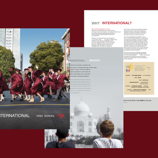
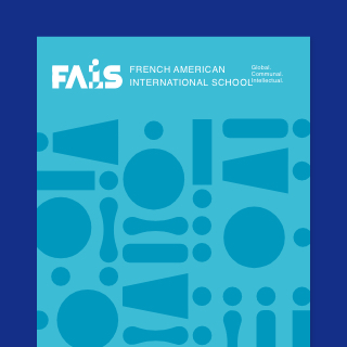
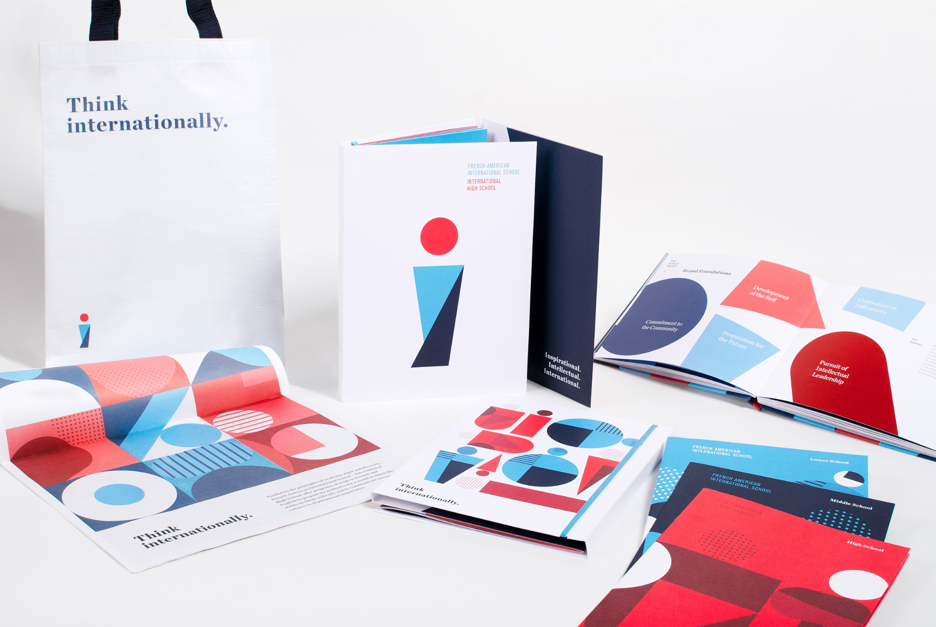
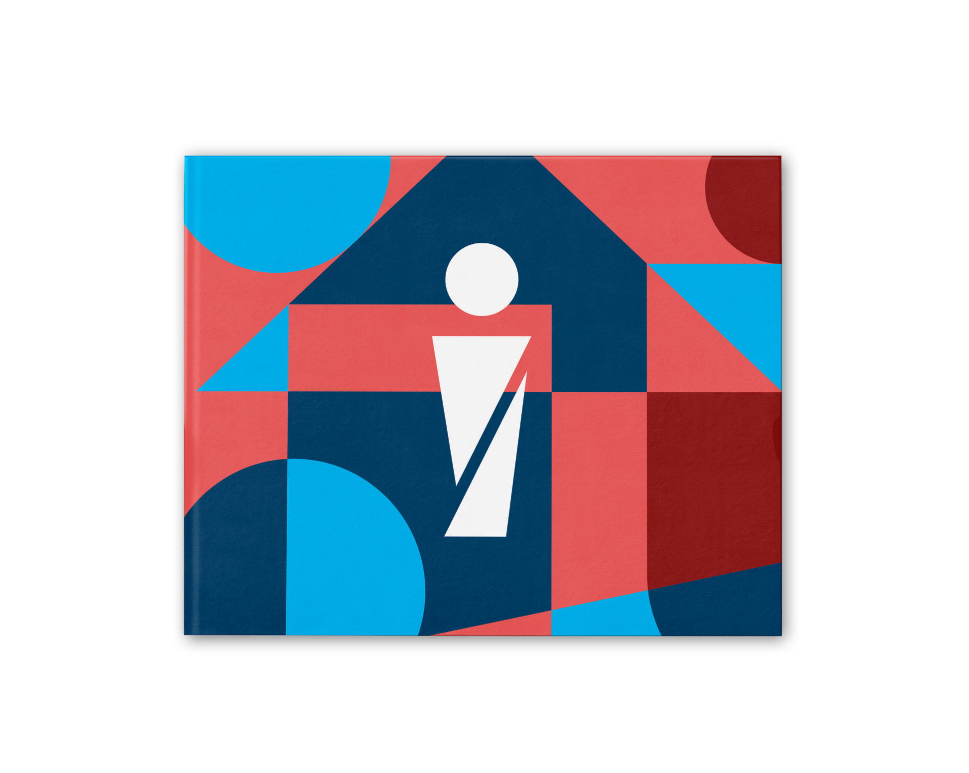
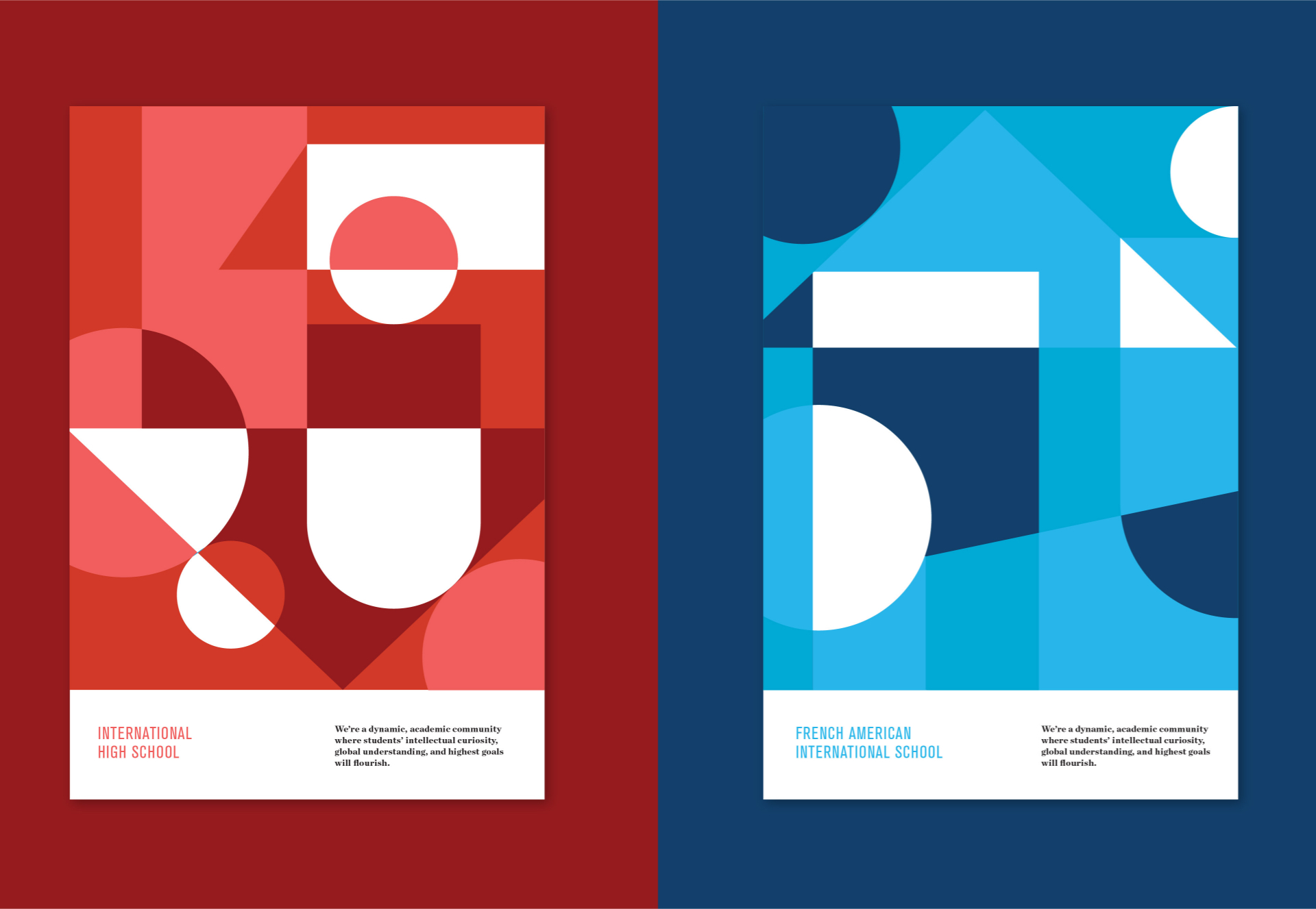
The foundational printed piece we developed is a portfolio that houses an introduction to the entire school alongside a set of three viewbooks banded together. We raised up each vital community within the school for families considering French American + International. By elevating and equalizing the distinct needs, approach, and benefits of the lower school, middle school, and high school – we aim to promote pride within the school and to unify it as a whole yet diverse community, through our design, illustration, and messaging.



Total immersion.
Unifying a multi-faceted school brand required our team’s delving into the experiences of each of the school’s various constituents to discover their hopes and concerns. We toured, listened, poured over research data, and worked closely with the leadership to explore and craft messaging developed in concert with a dynamic visual solution. This integrated work resonates with a wide range of stakeholders: both current and prospective students, families, faculty, staff, and alumni. We considered the community’s French and non-French aspects, its global-mindedness, and the school’s uniqueness being based in the heart of the SF Bay Area.
Set up for success.
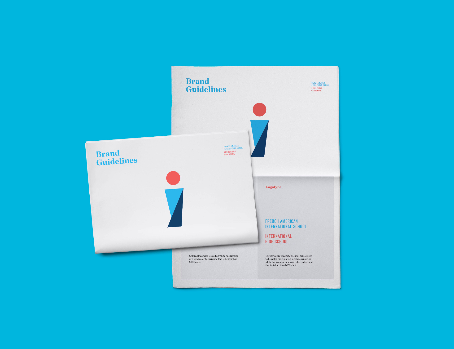
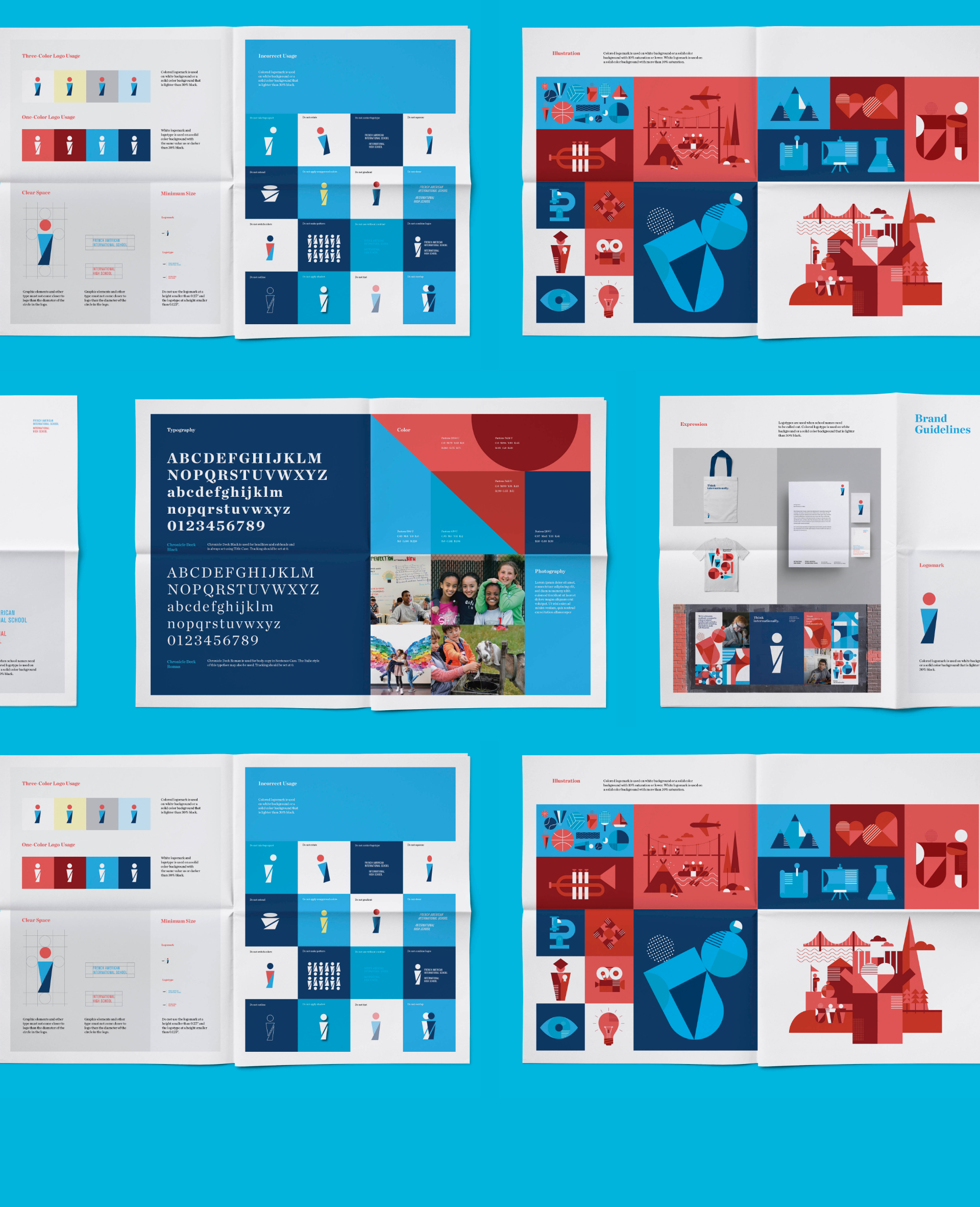
In preparation of the school’s exciting next half century and upcoming capital campaign, CDA created a hard-bound brand book to encapsulate the re-visioning process. It includes a succinct journey and the thinking behind of the school’s new look and feel, its unifying language, and a playful newsprint piece to explain brand guidelines for usage.
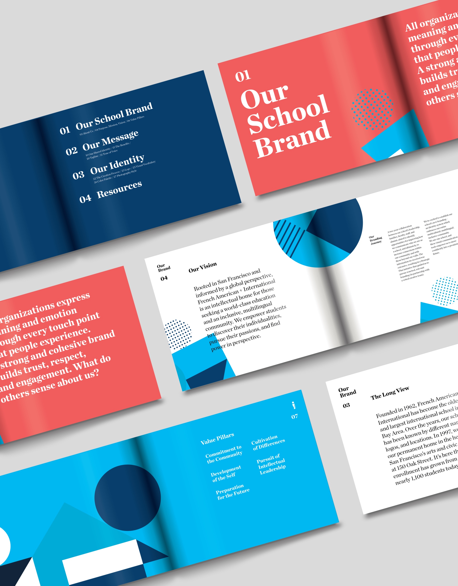

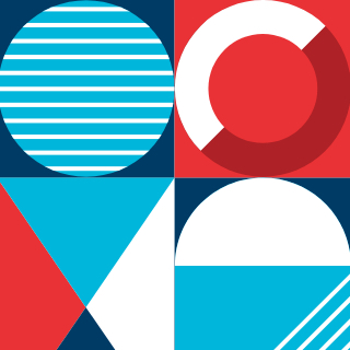
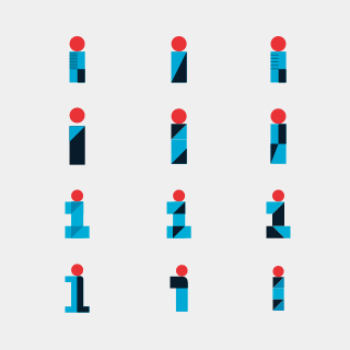
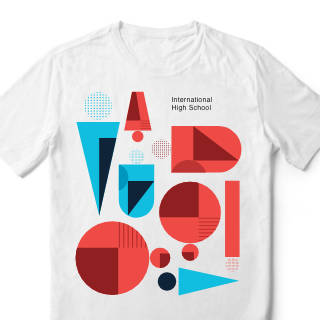
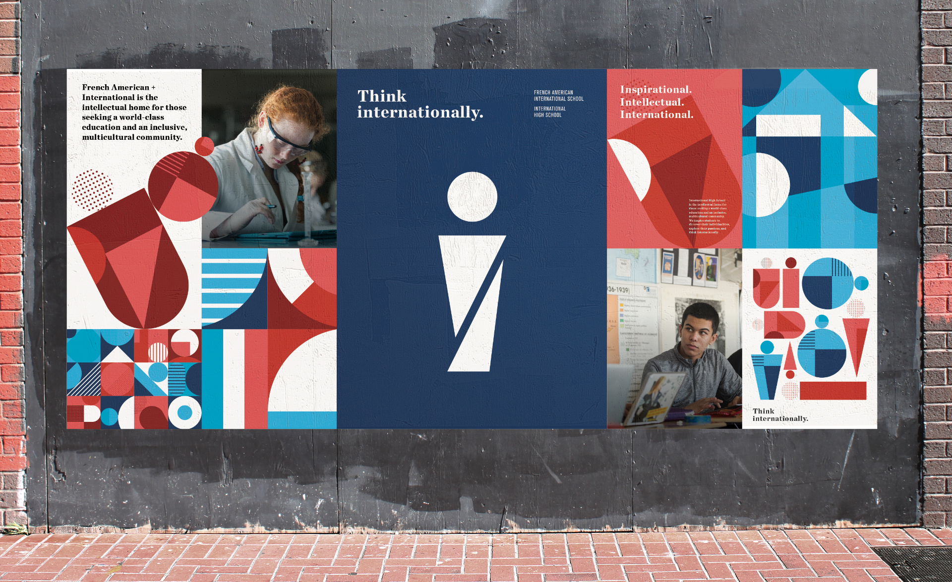
The resulting work seeks to exemplify the superior education French American + International provides. As we bring the brand to life from the daily touchpoints of school schwag to environmental graphics, print pieces to the digital space, the school has a brand identity it can be proud of, to rally members within its community and to gain distinction beyond the campus.

“I’d absolutely recommend Chen Design. The team is dynamic, creative, and collaborative. They took the time to listen to our reactions, offered insightful, informed feedback, and beautifully implemented our shared vision for the work.”Keelee Wrenn, Director of Marketing and Communications


