BOLD, SOPHISTICATED, AND SET TO GROW
Project Juice launched in 2012 with the help of a successful Kickstarter campaign and had rapidly outgrown its humble beginnings.
Providing certified organic, cold-pressed juices, nut mylks, superfood smoothies, cleanses, plant-based foods, and wellness shots, Project Juice is a micro-juicery that sources its produce from local farmers who practice sustainable farming methods. With multiple lines of products and a rapidly expanding following, the San Francisco company was poised to open two new northern California locations when its co-founders tapped Chen Design Associates with the need for an elevated, more robust brand system.
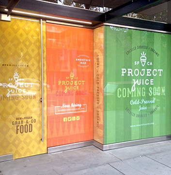
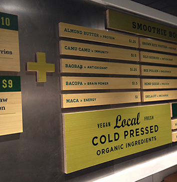
CDA created the comprehensive branding campaign to resonate with Project Juice’s energetic, health-minded audience and to strategically set up the company for further expansion. CDA was charged to develop the comprehensive branding campaign including overhauled identity, multi-channel packaging, retail merchandise, complete signage program, as well as retail store interiors.
“Our joint mission is to provide the highest quality organic juice and plant-based foods, and to inspire people to live healthier lives.”Lori Kenyon Farley, formerly of Ritual Wellness
In early 2015, Project Juice merged with Ritual Wellness in Southern California under the umbrella of the Project Juice brand
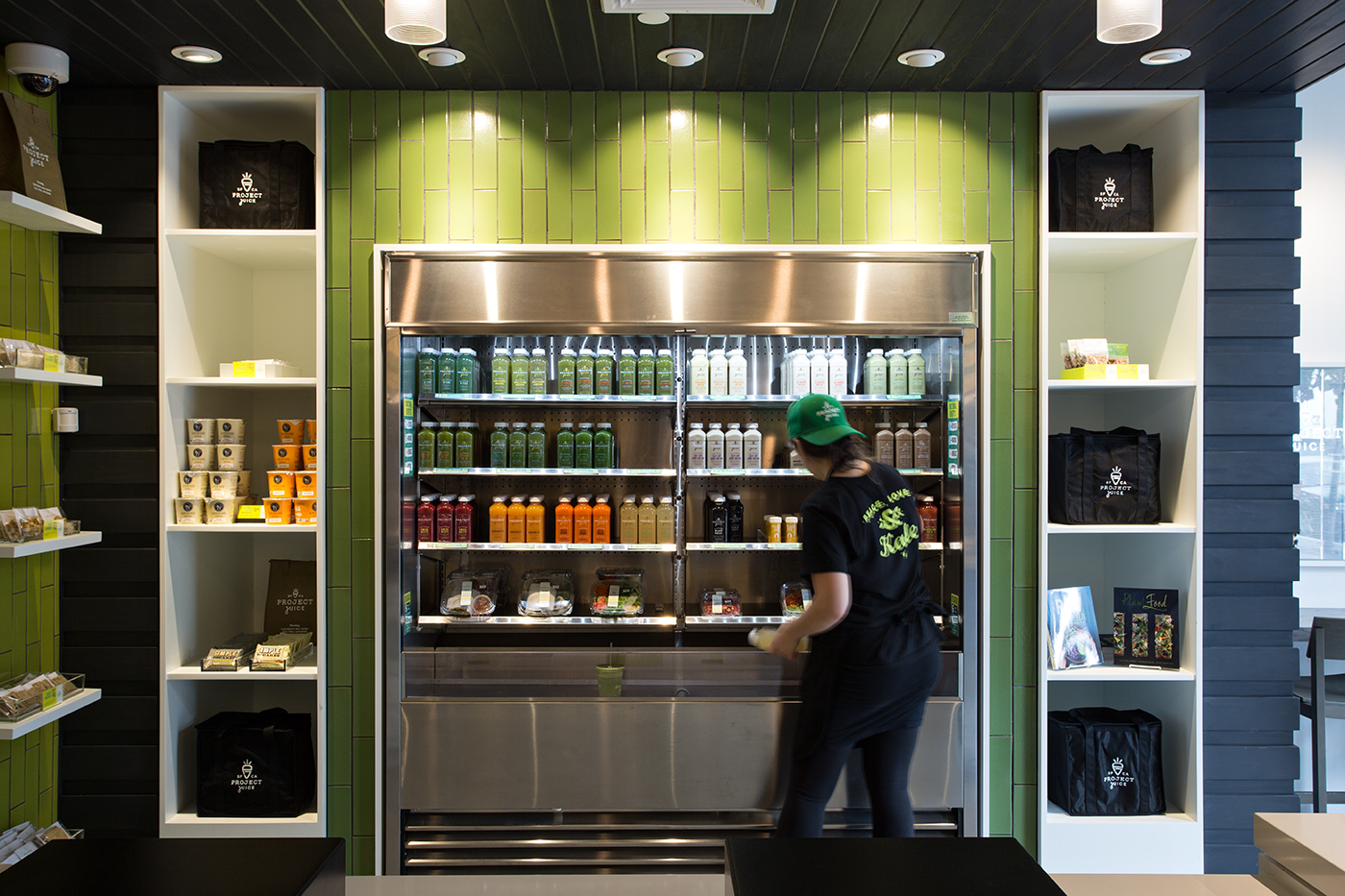
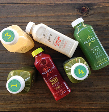
the CDA fridge was filled with colorful, nutritious bottles to keep our creative juices flowing.
Project Juice was born out of its co-founders’ struggle with food-sensitivities and allergies, then discovering the benefits of consuming a mostly plant-based diet plus nutrient-rich, cold-pressed juices. Sharing their own personal project became a mission to provide the same kind of health benefits for others in accessible forms and convenient ways. They see themselves as “personal guides to achieving elevated wellness,” pretty noble stuff for a juice company, and offer educational health tips, news, complete lines of cleansing regimes and prescriptive wellness packs to strengthen the immune system.
What’s wrong with the original identity? In the words of Armin Vit in his Brand New design critique, “The previous logo wasn’t very inspired, showing a contour of the bottle that the juices come in and a basic condensed sans serif. It wasn’t offensive or ugly, just slightly generic.” And consumers of generic products were certainly not the company’s target audience. We needed to distinguish Project Juice in a competitive market, build its brand sophistication and loyalty, and engage those willing to invest in their health and who care about the integrity of what they put in their bodies. The branding and packaging needed to express the craft and high value of what’s inside those bottles and a generic identity wasn’t the right strategy.
What was their vision of success for the new brand?
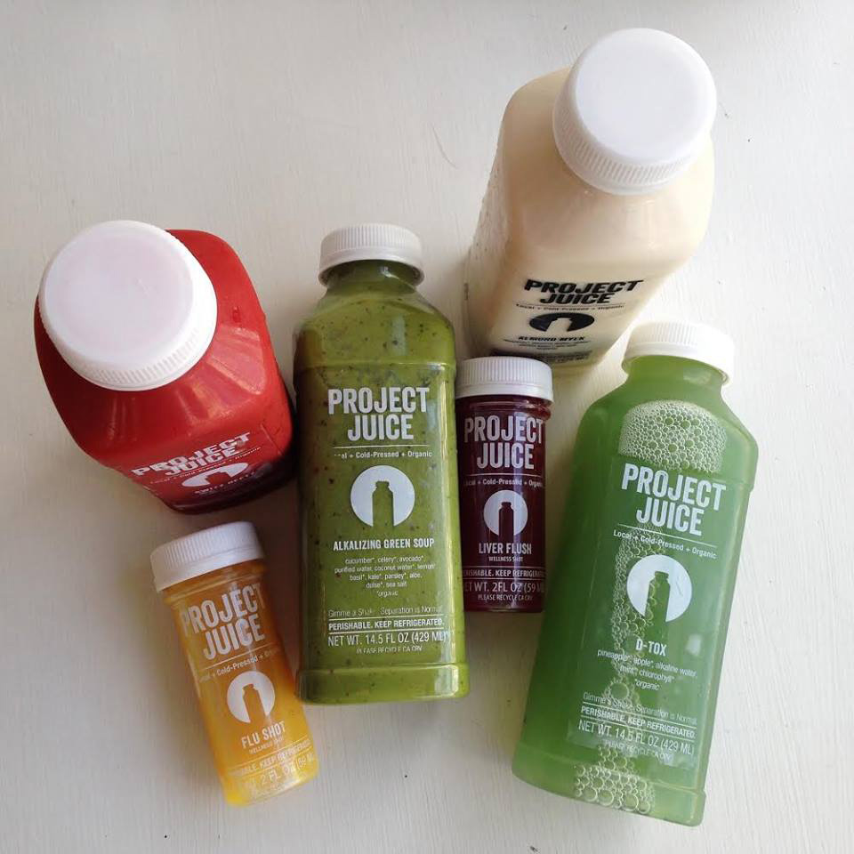
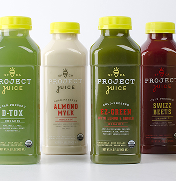
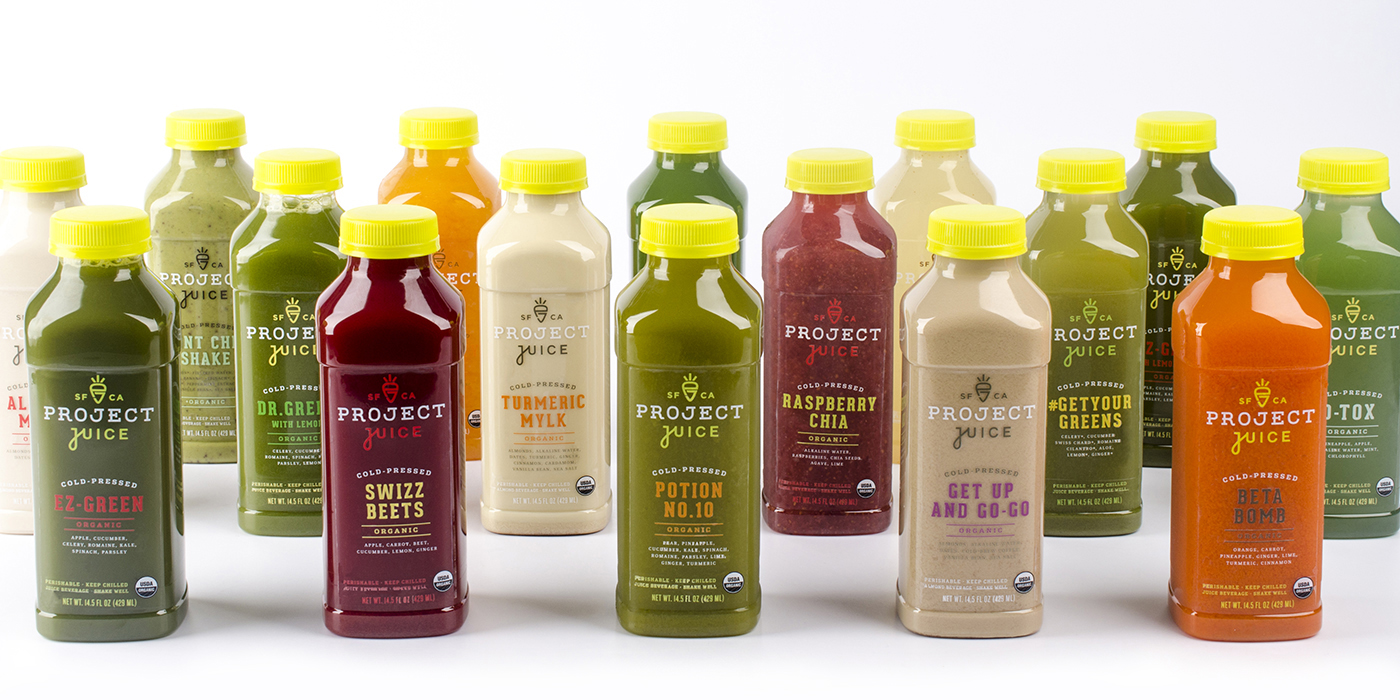
Overall the new branding needed to be clean, modern, bright, bold, fun, and exciting. Our clients wanted each Project Juice signature blend (there are over 20) to stand out on its own, be easily identifiable, even if the color of the liquid is the same, and of course fit within the overall branding family. The co-founders wanted us to highlight the specific juice’s existing name as well as the new Project Juice logo. They envisioned their consumers seeing their bottle and knowing right away that it’s Project Juice, recognizing the product’s name and ingredients, and wanting to drink it immediately because it looks so good.
Goals for Project Juice’s Rebrand:
- 01
- Build the value and prestige of the brand
- 02
- Distinguish the brand from the competition
- 03
- Create loyalty & motivation among followers
Archetypes

Scope of Work
Our explorations
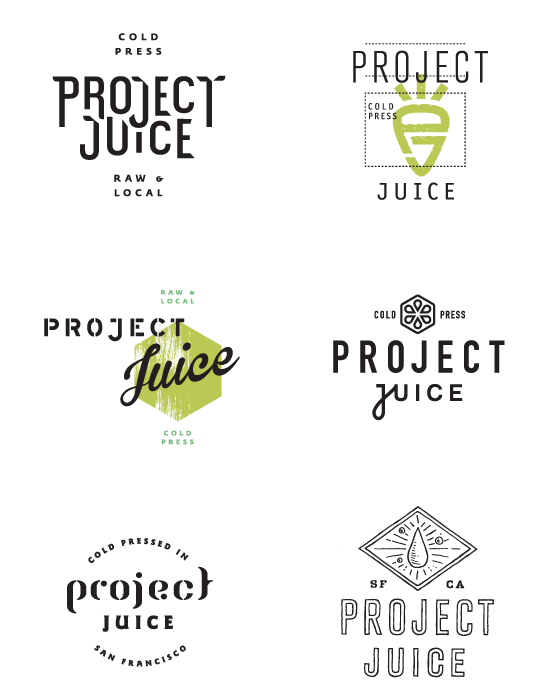
The final iconic and signature typographic elements were presented in the very first round of designs, originally configured with other concepts and treatments. Our explorations included resemblances to old fashioned juicing, produce crates, shapes reminiscent of citrus sectionals, play with letterforms and lockup forms to express different qualitities of the products, benefits, and resonance with the consumer.
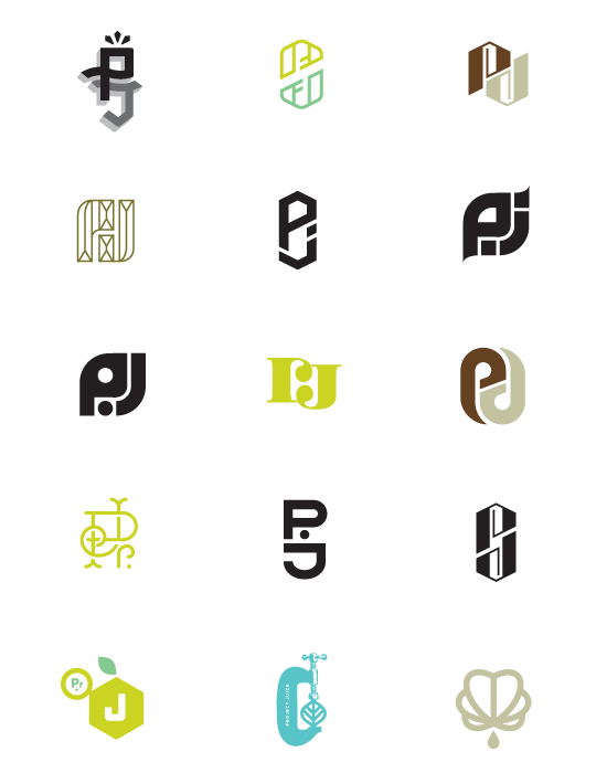
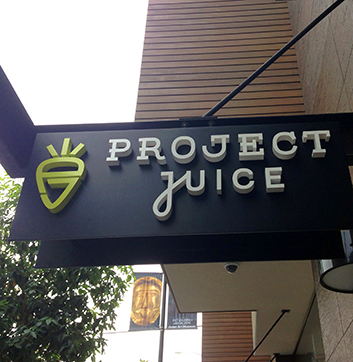
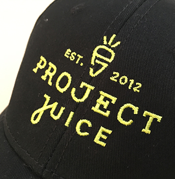
“The new logo has a great crafted feel to it with some inventive custom lettering that gives a lot of personality to each of the characters — that “C” is pretty great. The icon is a ‘PJ’ monogram that makes the shape of a carrot.…The new packaging is a great update with the new logo and updated typography that introduces a good-looking slab serif into the mix.”Armin Vit, Editor, Brand New
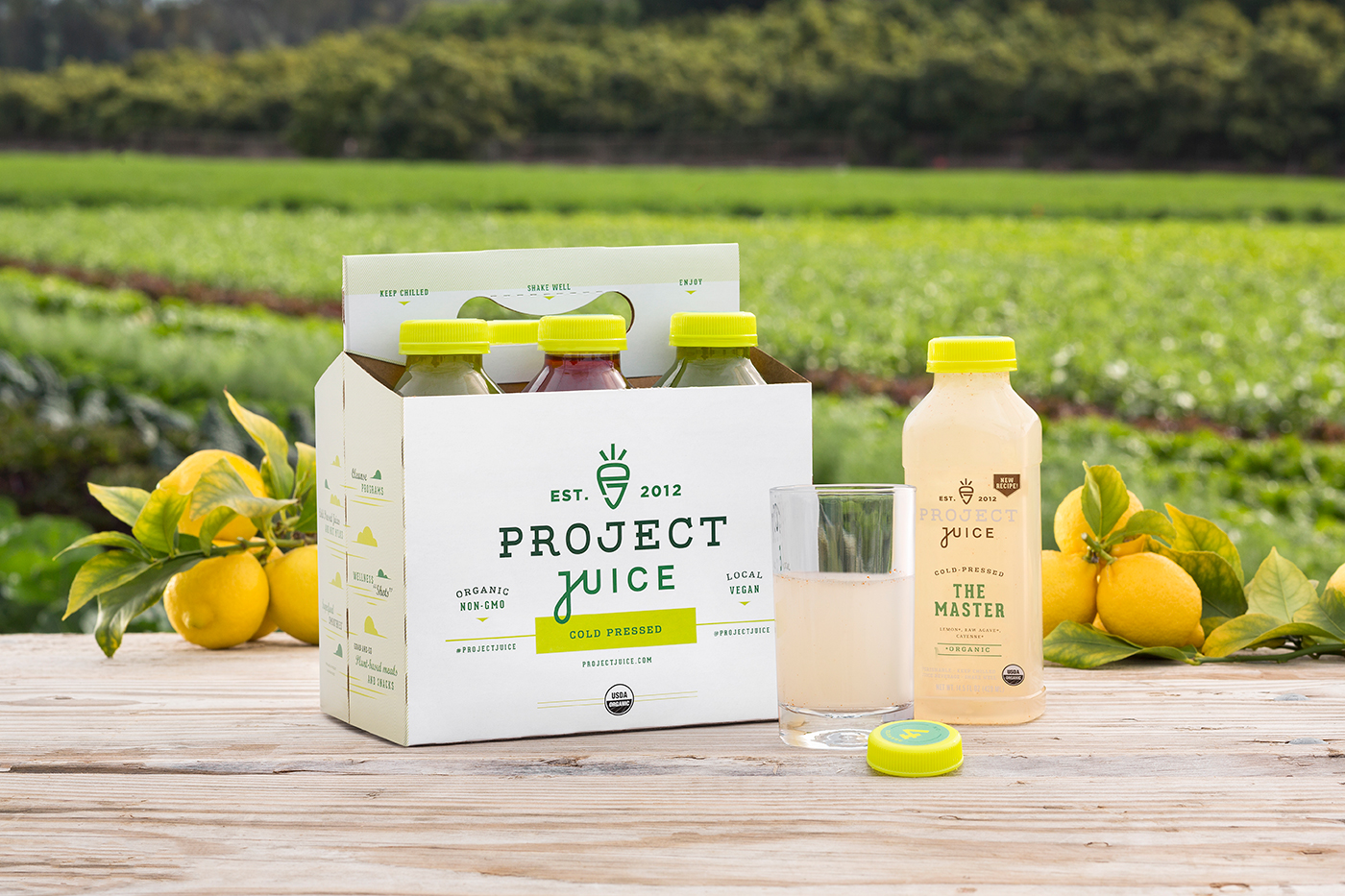
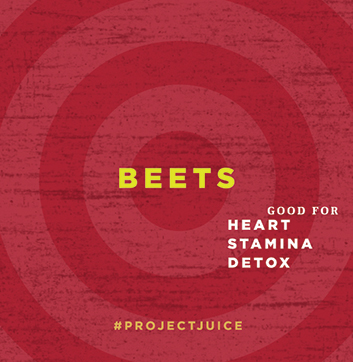
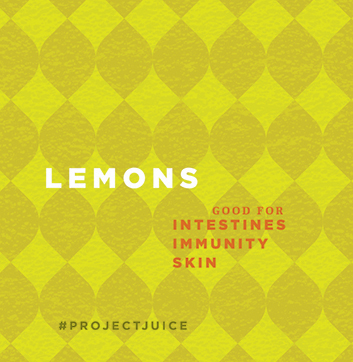
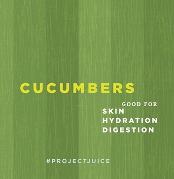
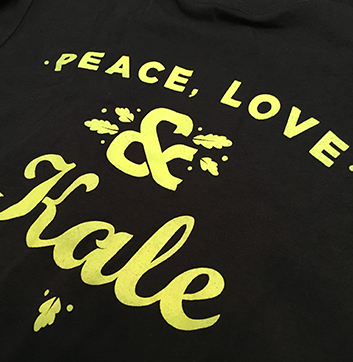
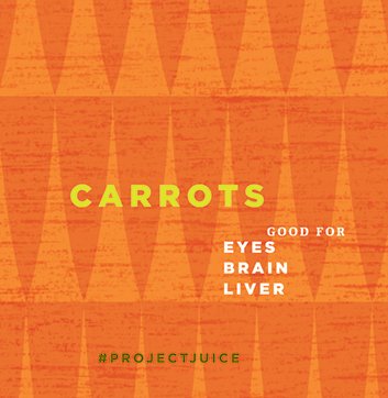
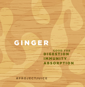
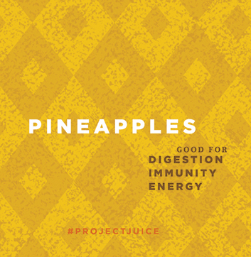
CDA’s design solutions graphically convey Project Juice’s unique selling points and educational facts, complete with a lively tone that expresses their benefits and brand personality. The sophisticated results cater to a broad but health-minded audience who appreciates the difference organic, locally-sourced, nutrient rich ingredients provide.
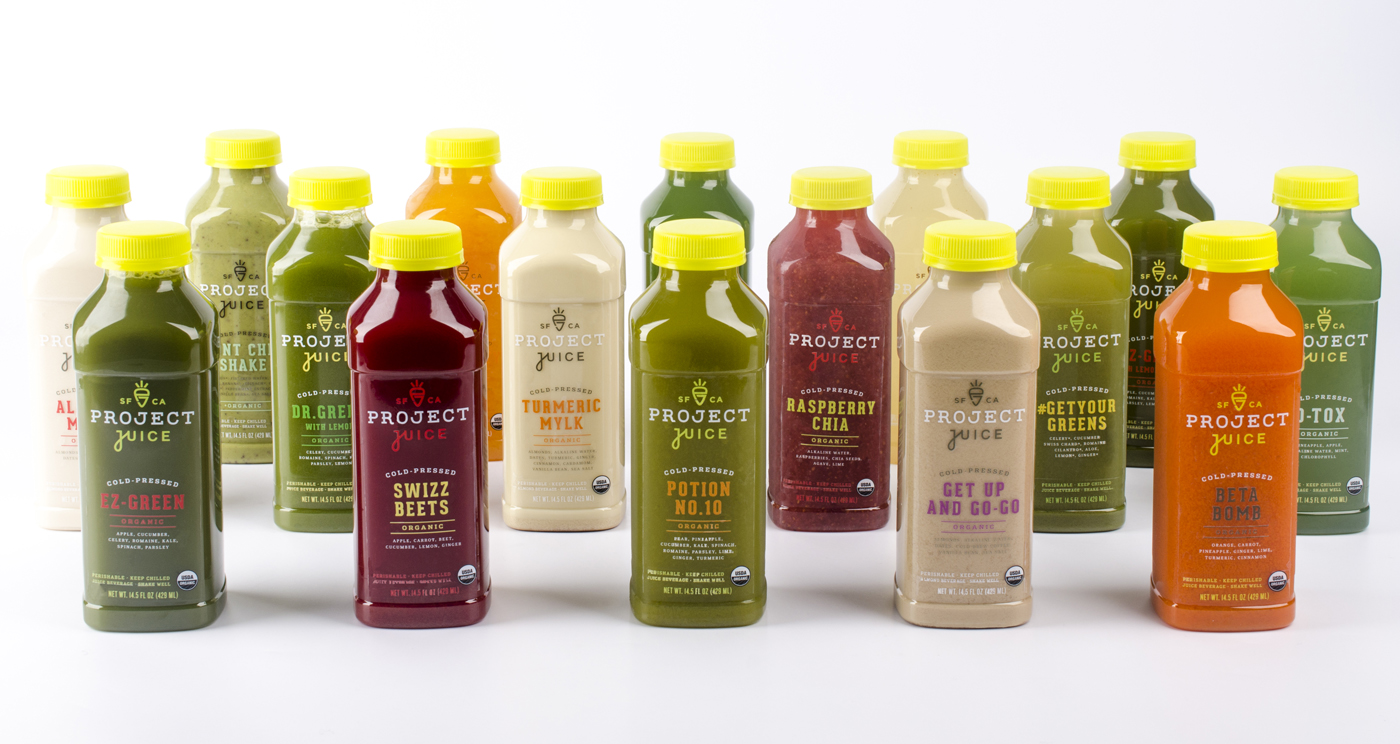
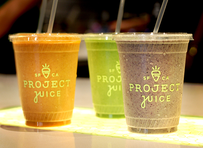
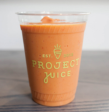
For the bottle packaging, the various luscious colors and textures of each product are showcased and set off by individualized type colors, each displaying its own personality. Customizing the bottles achieves the balance of each signature blend clearly belonging to the Project Juice offering, while standing out proudly on its own. Furthermore, a seemingly small change that makes a positive impact was our switch from white bottle caps to bright yellow—a detail that gives off an energetic, elevated shelf presence.
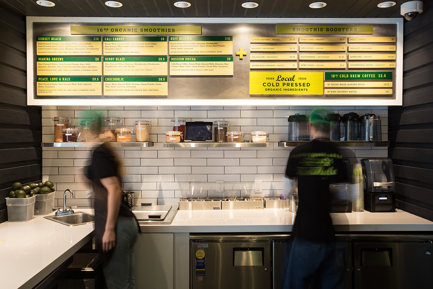
The lively comprehensive, integrated branding CDA developed for Project Juice positioned the company in a strong place for the growth they are experiencing. At last count there are 9 locations throughout the state, with availability of product at numerous partner locations and free shipping across the country via online ordering. The results are appropriately sophisticated, increasing the value of the brand and making it consistent with the quality and care that goes into each product. Best of all, the new branding conveys the story of who Project Juice is on many levels and is helping to grow loyalty among its followers.
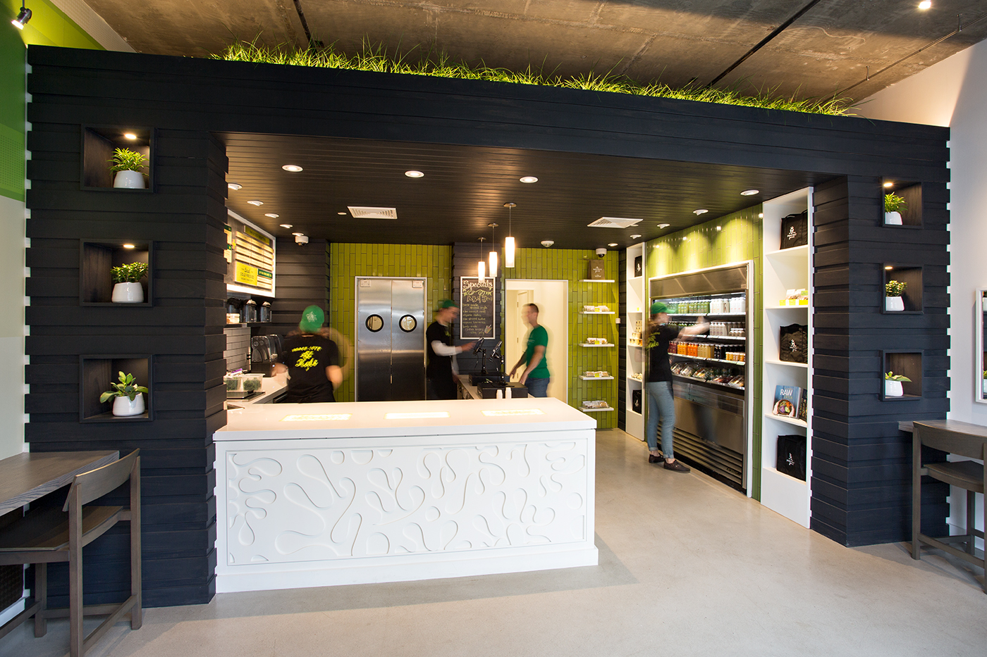
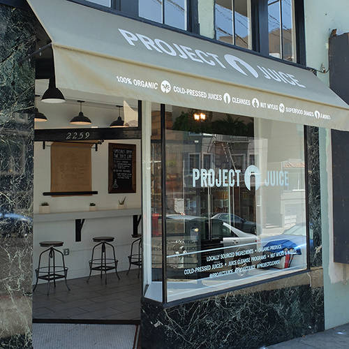
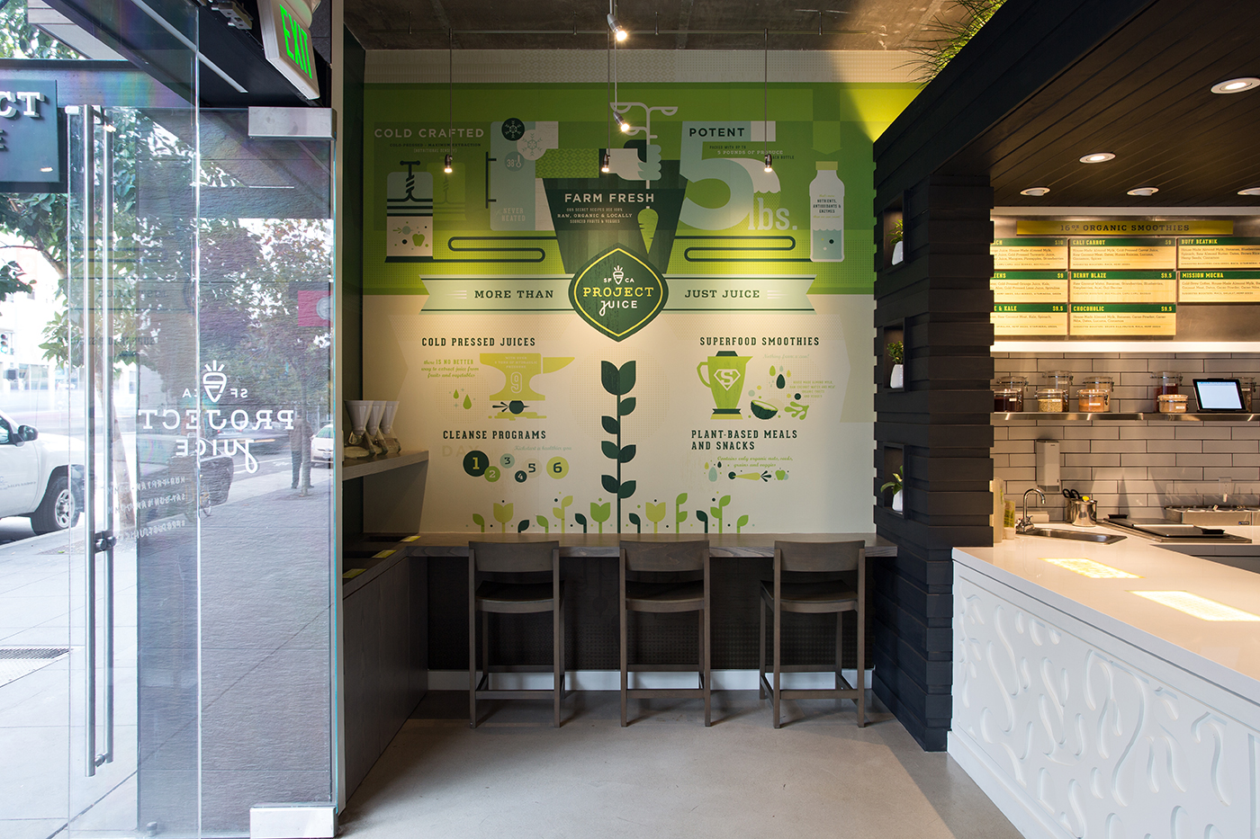
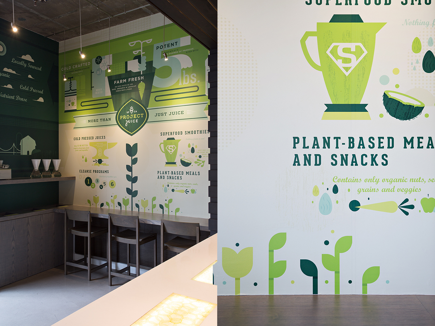
“The interiors leverage textures and light to create dramatic elements that communicate Project Juice’s brand vibe appropriately and effectively. The color palette pulls in the natural vibrance of veggies and fruits while maintaining that natural feel. Excellent work [by Chen Design Associates] as always.”Joseph Szala, Grits + Grids
Award
2016 Communication Arts Typography Annual
features
04.14.15 / Brand New: Reviewed
12.09.14 / Grits + Grids


