by Matt Porter / via Against the Grain, Neenah Paper blog
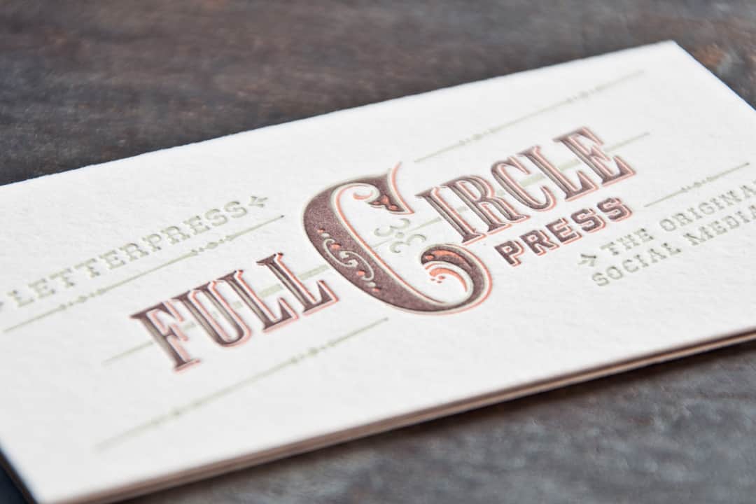
Did you just blow a great chance to make a nice impression with a potential client? Did you hand them a flimsy business card that featured a logo drawn by your girlfriend’s best friend? What were you thinking?! Start over: First think about the kind of impression you want to make. Superior paper letterhead and print business cards like this set from our friends at Full Circle Press in Grass Valley, California are exquisite examples of What Good First Impressions Look Like.
“We are printers so of course our stationery and business cards have to look great,” says Judith Berliner at Full Circle. “Our target audience is very discerning. So our cards have to reflect the highest level of quality in terms of paper, printing, and design. We have to sell ourselves to those who are trying to convince their clients to invest in the highest standards of design, print and paper excellence.”
Any piece of design communication should aim for curiosity and intrigue at some level. If you can’t get people to notice, it doesn’t matter how fascinatingly kickass your message might be.Max Spector, design director, CDA
First, Second, and Third Impressions
In fact, the best business cards leave more than one first impression. Recipients pass them around to others. So make wise choices in design, paper color, texture, and specialty printing. Make certain your cards, like the clothes you wear, are clear expressions of your character and values. If you market yourself as a provider of intelligent services of high quality, your identity and business card should convey the same. If they don’t, you might not get a second look.
Designer Max Spector says, “Any piece of design communication should aim for curiosity and intrigue at some level. If you can’t get people to notice, it doesn’t matter how fascinatingly kickass your message might be. It’s not easy to snatch away those few precious breaths, to convince someone to pause and invest a couple more seconds than they would have otherwise. So you use every tool available, and the choice of material is a major one. And of course once the piece gets itself noticed, the message should be authentic and the story should be rich and layered. So again you make sure that color, texture, and weight all help in the storytelling. One look at the Full Circle Press business card and you know this isn’t a normal offset printer.” // read more


